
STATEMENT OF INTENT
As a photographer, my primary focus is on capturing the beauty and character of architectural structures. Whether it is a towering skyscraper or a cottage, I am drawn to the lines, shapes, and textures that make up the built environment.
Through my photography, I aim to showcase the unique qualities of each structure and to tell the story of its place in the world. I am particularly interested in exploring the ways in which architecture reflects and shapes cultural values, social norms, and individual experiences.
I intend to take inspiration from the photographer Wayne Thom, who takes pictures of buildings from many different perspectives, using features like the worms eye view, taking pictures from afar and using lighting to his advantage by simultaneously capturing the reflections and the building at the exact same time, allowing the audience to be entranced by the image.
Another very influential photographer I aspire to be like is Iwan Baan who, similarly to Thom, takes photos of buildings from multiple angles and perspectives, as well as using light to enhance details in his pictures. One of the things that makes Baan's photography so impactful is his ability to capture the human element in his images. Rather than simply documenting buildings and structures, he often focuses on the people who use and inhabit them, creating a sense of connection and empathy in the viewer.
These are the types of photos I hope to achieve when photographing buildings, ones which improve people's views on buildings and how beautiful they can be, even when run down.
I intend on improving my photoshop skills through this topic by being able to enhance the details in the buildings and making them look sharper, as well as layering pictures on one another to make them look reflective, similar to Thom’s photos, to make the pictures much more interesting to look at. I also want to improve my skills with the camera by being able to look at a scene and figuring out which settings to use to make it look perfect in the first few tries. I can do this by messing around with settings like ISO and aperture to see which combination of settings make a picture look as natural and interesting as possible.
Towards the end of my project I hope to have learnt many new skills with the camera, like how settings change the look of my photos, comparing them to ones I took with different settings, like ISO, aperture and white balance, as well as more ways to edit a picture to make them more interesting and enticing to look at.
MOCK

This photo was taken in summer 2017 by a photographer named Simon Buckley, a Manchester-based architecture photographer and actor, born in 1965 in Merseyside. His work has been exhibited and published internationally, after taking interest in the themes of the urban environment. He took this photo for a company after being commissioned to archive the building of the new HQ in Salford. In the background, you can see song lyrics by a band called Joy Division. They were formed in 1976 in Salford, UK, which is in Manchester. Joy Division is a very influential band, especially in the UK, which emphasises the positive meaning behind the photo, showing the love for the artists through colour and exposition. Manchester is still a very musical part of the UK, which shows our love for music and how it can influence others in many different ways. Macclesfield has a memorial for a member of Joy Division, Ian Curtis, showing us more of the love that Manchester has for not only the band, but the members, music and support for those who went through a similar situation as the singer-songwriter.
This photo depicts a range of different buildings in shot, including a geometric formation of concrete and pipes at the bottom, with a small group of workers underneath. The audience is immediately drawn to the bottom, which act as leading lines for the rest of the picture, allowing people to follow it to the rest of the photo, which links the structure and makes it stable. To the audience, this could show a sign of structure and integrity, showing that, one thing can link with another and make it stronger. This idea can be applied to real life, since some tasks make your understanding clearer. The addition of the colourful and vibrant buildings in the background contrast with the front, showing how simple and rough structures make bigger and more beautiful things. This photo was taken in landscape, showing the beauty of buildings by getting more of them in the shot. In the background, there stands a large billboard, with the title and lyrics of the song, “Love Will Tear Us Apart” by Joy Division, further opposing the dull foreground. I believe this photo can represent change in life. On the surface, everything starts off dull, boring, lifeless, but soon improves, being more beautiful and vibrant, as things go on. The overall feel of this image is dark, which is emphasised by the sky and the unfinished buildings, showing the audience that unfinished things may take time to complete and to not give up, or else they won’t look like the buildings in the background. This picture is mainly composed with the colour grey, universally symbolising neutrality and balance, telling people that unfinished things may not always lead to sadness, but rather being content or even satisfied and excited, knowing that once it’s finished, it would turn out to be multiple times more interesting. The photographer may have done this in order to subtly encourage people to improve what they're working on, like finishing it. Additionally, the lights look similar to stars, universally representing positivity and happiness, mostly being linked with angels and other peaceful beings, calming the audience down and giving them a sense of peace. The colour yellow is used in the background and can symbolise happiness and hope, as that's the colour of the sun. This is done to show that, although there may be very little hope, it is still worth starting something, or trying to finish it off.
I believe that the photographer used an ISO of 400 or 800, seeing as the picture is still very dark and illuminated mostly by the street lights, giving a more natural look. It could not have been 200, as that would be way too dark, making the scene unidentifiable. If the ISO was higher, the photo would be really grainy. Furthermore, the white balance would most likely have been set to shade, as that would have been the closet setting to get the desired effect. To make sure that the background wasn’t out of focus, Buckley must have used a much more narrow aperture, since that would make sure that it kept all sections of the picture in focus, rather than foggy and incomprehensible. The picture uses leading lines to guide the viewer towards different areas of the picture, as well as the rule of thirds to structure the photo, by having the bright and interesting buildings in the middle vertical third, which is where the audience will most likely look first, surrounded by the unfinished buildings on the bottom and on the right. This is also a use of framing, as the neutral colours highlight and contrast with the more interesting buildings. I believe that the photographer has used a tripod, due to how straight and stable the picture is, although it could have been done without one, however it would make it more difficult to do so. The lens he used is most likely a standard 18-55mm lens, as he didn’t need to zoom in too far, seeing as it’s very accessible to the public, so he could have taken the photo up close.
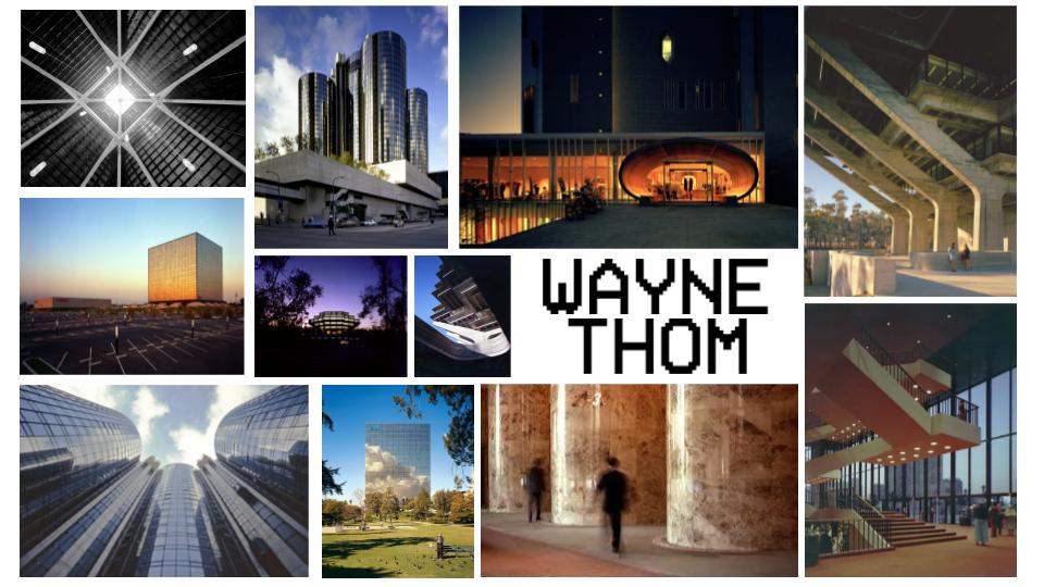
Wayne Thom is a photographer who focuses on capturing the beauty of modern architecture. He was born in Hong Kong on December 13, 1933, making him 89 years old, and studied photography in college in Pasadena, California, graduating in 1968.
Over the years, he completed many different achievements due to his stunning photos, some including being a speaker at the International Exposition of Professional Photography multiple times and a member of the LA Tech Advisory Board, and his photographs have been featured in numerous publications and online platforms. He has over 12 of these impressive achievements, which he earnt in the span of 5 decades. This adds up to over 2,800 projects, mainly around Los Angeles. He also managed to have his own exhibition in the WUHO Gallery in Los Angeles, featuring some of his best photos.
“You are photographing the reflection, not the building. The building is just a frame for the reflection of the sky.” He says, from an interview from February 2021 with Mimi Ziegler. In this interview he explains his thoughts behind his photos and how he achieves his final results. “Mirror glass building is a nonexistent building,”
Personally, I take inspiration from his photography, since he takes pictures of buildings from many different angles, worm’s eye view, bird’s eye view, and so on. I also like how he uses lighting to manipulate reflections to take a picture of them and the building at the same time. I chose to write about him because I feel like his photos are very influential to people and he seems to capture the beauty of buildings, which is something I wish to do myself.
SHOOT ONE:
Project title:
Architecture shoot
Aims for shoot:
I want to have a range of different buildings and landscape, as well as textures. I want to be able to demonstrate the variety of buildings and how each has different styles to another. This will let me have more opportunities for edits as each will turn out different due to their uniqueness.
Links with photographers:
Wayne Thom, someone who takes a range of different pictures of architecture and makes it look breathtaking. I love his composition and the way he makes everything look so intentional but natural at the same time, as he has a great eye for detail.
Location:
Outdoors, Media City
Props and kit:
>Camera
>Short range lens
>Lens filter
Camera settings:
As I will be outside, the ISO needs to be roughly 100 or 200 as the sun will already work as a light source, therefore I do not need a large ISO, or else the pictures will be grainy. I want my aperture to be really small, as I do not want anything out of focus, which I am always able to change in Photoshop after. My white balance will be at daylight, assuming it is sunny, since the colours will be unnatural if it was set at cloudy, for example.
Compositional features:
I want to use far away shots and mostly asymmetry as it might be very difficult to have symmetrical photos due to the amount of different textures and styles of buildings.
BBC BUILDING


BRIDGE


IMPERIAL WAR MUSEUM


ITV BUILDING


APARTMENTS


WATER/SALFORD


BOAT


WATER


SALFORD QUAYS MALL


GARDENS


FLOUR MILL


DOG STATUE


REFLECTIONS


TALL BUILDINGS


BESTI really like this image, mainly due to the lighting and how the sun peeks through the clouds and I like how the building looks like a silhouette. The image is very dark, which was caused by a low ISO, most likely set at 100. If the ISO was any higher, the image might have come out brighter, or maybe too grainy. The colours are very orange, which was caused by the wrong white balance, most likely set at Shade, which is the warmest setting, at 7000K. The background, which are the clouds, are in focus and very clear, meaning that the aperture must have been very small, around F22 or F16.
|
|
|
|
WORSTI dislike this image as I took it very quickly, with no regard to what it was going to come out like. I had used too low of an ISO, which was set to around 400 or 800. This is clear because of how dark the image is, but not dark enough to make the image look grainy. The foreground consists of people who I did not want in my image, and there is a pole with a sign, blocking the building. The background is not out of focus, since the aperture was set at F16, meaning that the entire picture is mostly in focus. There is no clear compositional features, since I did not intend to use any.
If I were to take this picture again, I would make sure to get closer to the building and pay attention if people were in front of my camera before taking the picture. |
BESTI believe this is my best image I took during this project, as the photo is structured really well. I like the fact that there are almost no people in the image, making it look empty. I used the feature of asymmetry, which is clear, as most of the buildings featured in this picture are on the right side, compared to the left. The photo was taken in slight shadow, therefore I decided to use the white balance of Cloudy, as it's warmer than shade, and would have neutralised the cold colours. Furthermore, I believe that my aperture was set to F22, as none of the image is out of focus, and a small aperture would have made the image darker, therefore the ISO could have been 400, since I believed that 100 would have been slightly too dark.
|
|
|
|
WORSTUnfortunately, this image is really good, apart from the colouring. The white balance was too blue, since I had the white balance set at Fluorescent, rather than the correct setting, which would have been Direct Sunlight, as this picture was taken in the sunlight. The aperture was set at F22, since most of the background is in focus, and the ISO was set at about 200, since the sunlight was enough to light up the scene. If the ISO was higher, the photo would be much too overexposed. I dislike the fact that this image is so discoloured and that some of the building at the top is cut off.
Next time, I will make sure to have my white balance set at the correct value so that it will not look so blue, and focus on having the entire building in frame. |
EDIT ONE:


BEFORE
|
AFTER
|
I started this edit off by wanting to change the colour of the background and reflection, so I decided to find a good picture to overlay on the window, then cropping and editing it to make it fit. I removed the overlap and turned the opacity down slightly to 57%. I found a picture of some dark clouds online, which I decided to overlay across the original sky. I selected it using quick select and made a new layer, where I created a clipping mask with the new picture. After I was happy, I merged them together and changed the colour of the buildings using curves to make it blend in and seem real.
HOMEWORK


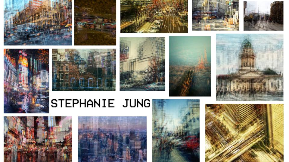
Stephanie Yung is a photographer based in Germany and takes photos on multiple topics like nature, flowers and cities in places including New York and Japan. In 2010 she finished her studies and decided to try photography, which she has been doing to this day, taking it seriously in 2012. She travels to 'hectic' and crowded places as she calls them in order to take photos of big cities and capturing special moments. Jung had her work published in multiple newspapers and magazines over the years too.
EDIT TWO:


FINAL IMAGES
For this edit, I did an overlay between different images, picking three different background images and adding texture over the top with multiple different blending modes. I chose three different outcomes with the same images as I thought all of them looked good in different ways.


BEFORE
|
AFTER
|

For this edit, my plan was to make it very textured and interesting, having different colours and textures included. First, I lightened the original picture and I used overlays and created clipping masks over the top of a cut out piece so that the picture is affected. I also used a brush to give it a spotty texture and made the colour red. I decided to change the colours in some areas rather than textures. Some tools I used included overlays, blur and saturation. I made sure each square was different from the rest, some being clearly bigger than the original picture, or even moved slightly to the side. This is to make the picture more interesting and increases how long the audience look at it.
FINAL GALLERY


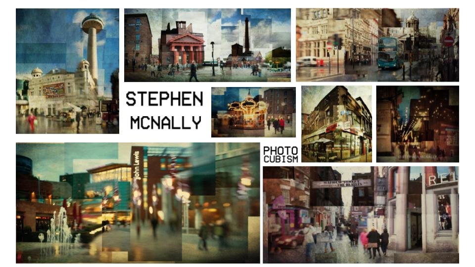
In this project, I wanted to highlight the beauty of architecture and people’s skill in making a rainy city seem better than it really is. I planned on showing structure through my photos and edits, especially with closeups and features of nature, like plants, flowers and bodies of water. I linked my work with Wayne Thom for the aesthetics and Stephen McNally and Stephanie Jung for the editing, using different colours, layers and blending modes. Jung for example, used a lot of overlays, making a complex visual gallery for people trying to learn more about the layout of buildings. McNally also did a similar thing, using sections of different photos taken in the same areas to create one, demonstrating the views of different people seeing the same place or looking back at their memories of such places. I wanted to relate my work to these artists, since I believed that beauty in impressive, towering, outlandish towers such as skyscrapers or offices and old, abandoned buildings is something that has not been photographed enough.
I wanted to experiment with different camera settings, as they were my weakest point, since I did not have much practice nor experience, but this significantly improved my knowledge of the relationship between ISO, aperture and white balance. I made a couple of mistakes, however I managed to improve it without much struggle. I used different composition techniques, especially the rule of thirds, centering all of my scenes to make it look the most interesting to the audience, as I believe that subjects in the middle of photos are the most effective. I had to find a balance between beauty, efficiency and fascination about the subject, which led me to create a combination of interesting images.
I wanted this project to relate to everyone, as I knew that everyone is influenced by architecture in one way or another, as we all are surrounded by buildings no matter where we go. Everyone works or lives in a building, some being more intricate than others, each shaped differently. If every piece of architecture was the same, life would be boring and we would have nothing unique to look at, which is why I photographed the best areas in Manchester so that I could demonstrate how nothing is exactly the same.
