
STATEMENT OF INTENT
My main focus for my drawing with light project was to show the possibilities of lighting to tell a story or make a drawing, an interesting combination of lights to intrigue the audience, allowing them to make their own interpretations behind it.
I aim to highlight the interesting look of light and how they can combine together to make something beautiful, like a group of different lights, as I’m interested in how colours can complement each other or mix together to create a new colour, something that people haven’t experienced before, and something that’s unable to be seen without a camera.
I intend to take inspiration from Vicki DaSilva, a painting with light photographer who shows meaning through her photography, like what she believes is right or wrong. I want to use the rule of thirds, where I have the light painting in the middle, and empty space on the sides. I want to be able to use contrast as well, having two different colours which complement each other in one photo.
In terms of editing, I would like to make something similar to Bob Eckert, someone who uses a kaleidoscope filter on his photos, giving them intricate details and making the patterns much more interesting. I believe that this will make my work look complex.
I intend on improving my skills in photoshop by using a new feature I’ve never touched before, as well as use a new website for editing called Photopea, a replica of Photoshop. I want to be able to enhance my photo skills and make them more effective to the audience since they can interpret whatever they want. This project will help me in using new camera settings, like slow shutter speed, and this can allow me to experiment in what looks good.
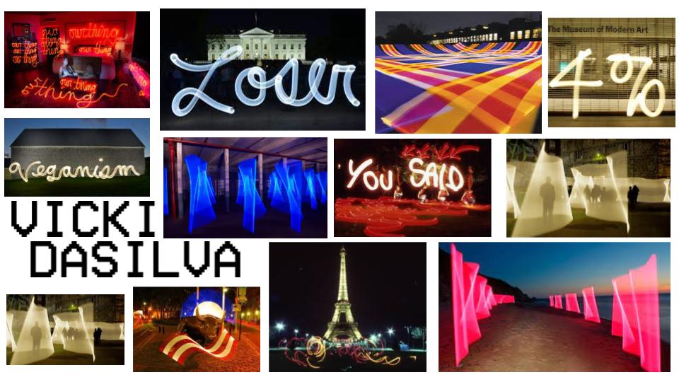
Vicki DaSilva is an American photographer and graffiti artist who makes single frame light photos which she says is “light graffiti”.
She was born in 1960 and started her light painting career in 1980, writing inspirational words on controversial topics, like “climate change” and “isolation” to promote change in society. She’s a very inspirational person to many people, including multiple photographers who try to replicate her work in different ways. She moved to New York City in 1983, where she improved her skills in photography after getting her BFA in The Kutztown University of Pennsylvania.
She did an internship and worked as an assistant for a well known video and performance artist by the name of Joan Jonas, where DaSilva was introduced to many new artists, which is where she got inspiration from. She started to get more exposure to new fans of her work through YouTube, where she started posting her process of taking pictures in 2009. In 2012, her work was chosen from 35,000 other pictures to be featured and displayed on billboards in Times Square, NYC, for the ‘Art Takes Times Square’ event.
I enjoy her work due to the inspirational and subtle messages she puts in her work, and how she does this in order to change her audience’s views in society. She's not afraid to express her feelings to the world through her photos, which is very inspiring to me as I would like to make something similar and convey a message through photography.


BEST |
WORST |


CANNOT UPLOAD FINAL |
FILE CORRUPT |
ill find the picture once my computer gets fixed :(
I decided to make this edit with a picture I took in my previous project in the background. I had no real inspiration, but I decided to make the theme of infinity, trying to add a hidden meaning. I wanted to show that existence is repetitive and infinite, but I didn't have an appropriate picture, so I used one with the ITV logo, to show the cycle of large companies and how they're never ending, and will always exist. I did this by cutting out the light drawing and turning it into a new layer, then taking the picture of the ITV building and setting a clipping mask, making sure that it was where I wanted it. I turned the opacity down so that it looked the way I wanted it to, then drew more infinity signs around it with the pencil tool.
I decided to make this edit with a picture I took in my previous project in the background. I had no real inspiration, but I decided to make the theme of infinity, trying to add a hidden meaning. I wanted to show that existence is repetitive and infinite, but I didn't have an appropriate picture, so I used one with the ITV logo, to show the cycle of large companies and how they're never ending, and will always exist. I did this by cutting out the light drawing and turning it into a new layer, then taking the picture of the ITV building and setting a clipping mask, making sure that it was where I wanted it. I turned the opacity down so that it looked the way I wanted it to, then drew more infinity signs around it with the pencil tool.
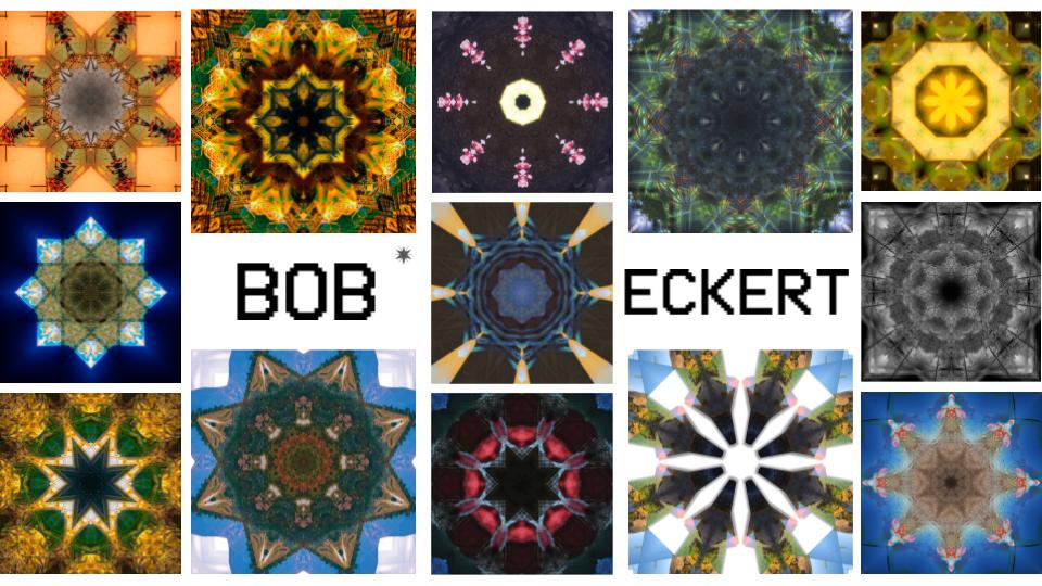
Bob Eckert is an American photographer who lives in New Mexico and specialises in journalistic photography. His portfolio ranges from “man-altered” landscapes to street photography and things like industrial plants, editing them to make them as interesting as possible. On his website he has a section solely dedicated to his kaleidoscope edits.
Apart from being a photographer, he also is an editor for a weekly newspaper by the name of Rio Grande SUN and has earnt multiple awards from the NMPA (New Mexico Press Association), getting first place in 2019 in the photo stories category. Most of Eckert’s photos have been taken in Albuquerque, New Mexico, from Gay Pride Parades, aquariums, aircrafts and even cell phones. He says this is because it causes the audience to ask more questions than receive answers since it’s a more powerful and engaging approach.
Apart from being a photographer, he also is an editor for a weekly newspaper by the name of Rio Grande SUN and has earnt multiple awards from the NMPA (New Mexico Press Association), getting first place in 2019 in the photo stories category. Most of Eckert’s photos have been taken in Albuquerque, New Mexico, from Gay Pride Parades, aquariums, aircrafts and even cell phones. He says this is because it causes the audience to ask more questions than receive answers since it’s a more powerful and engaging approach.


FINALS
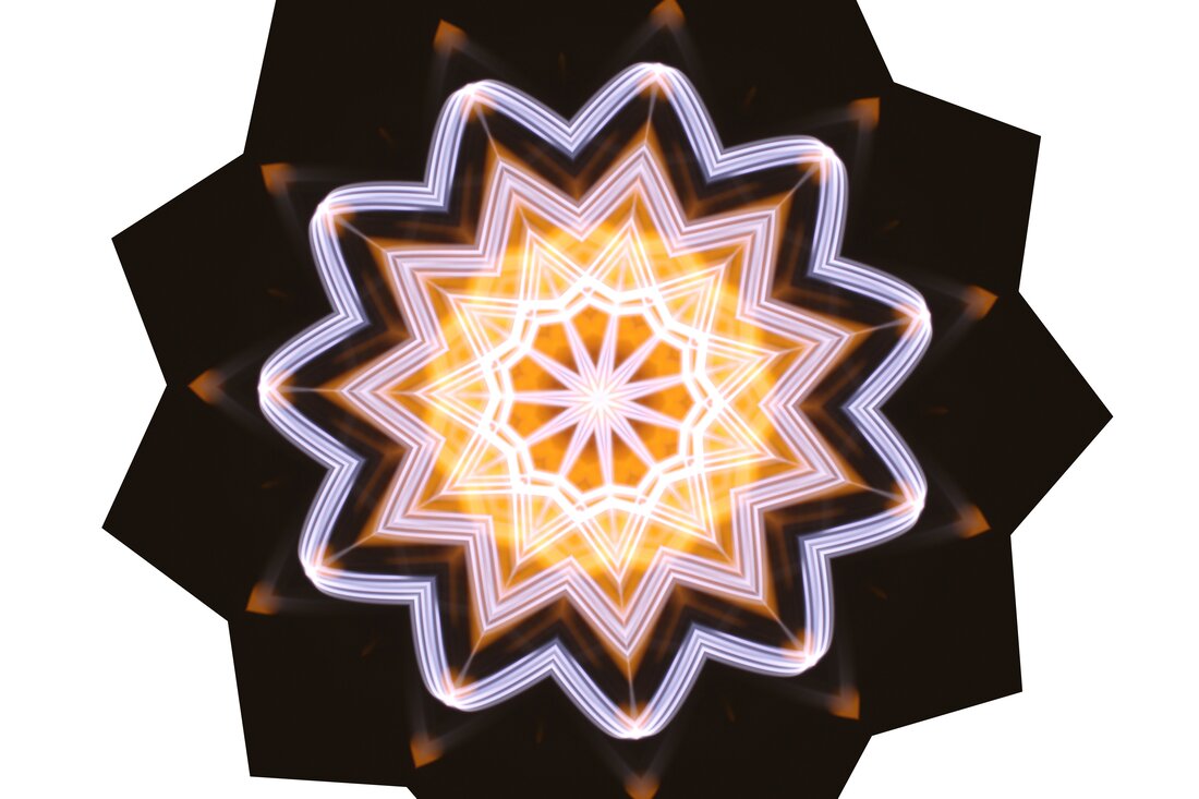
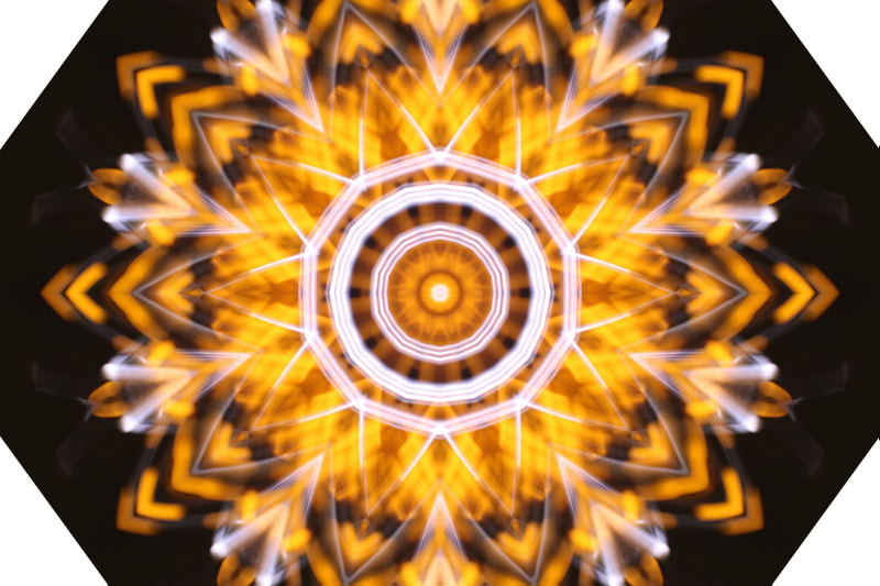
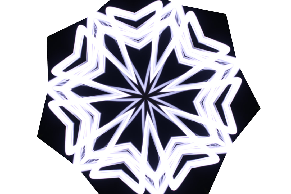
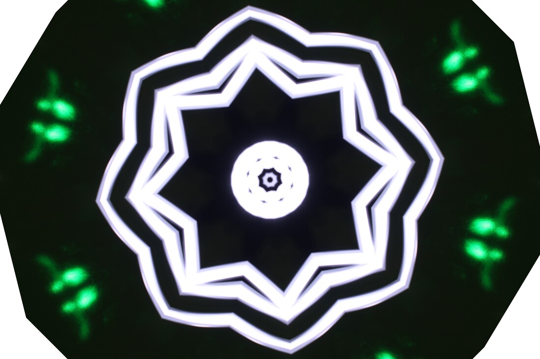
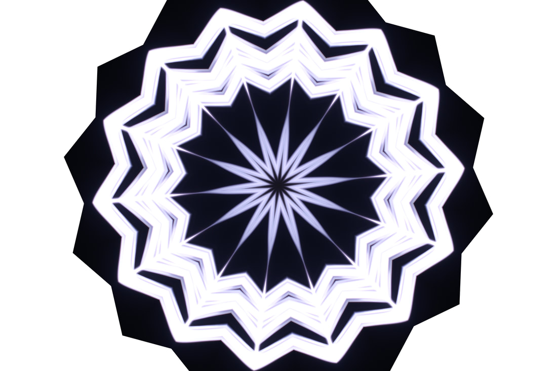
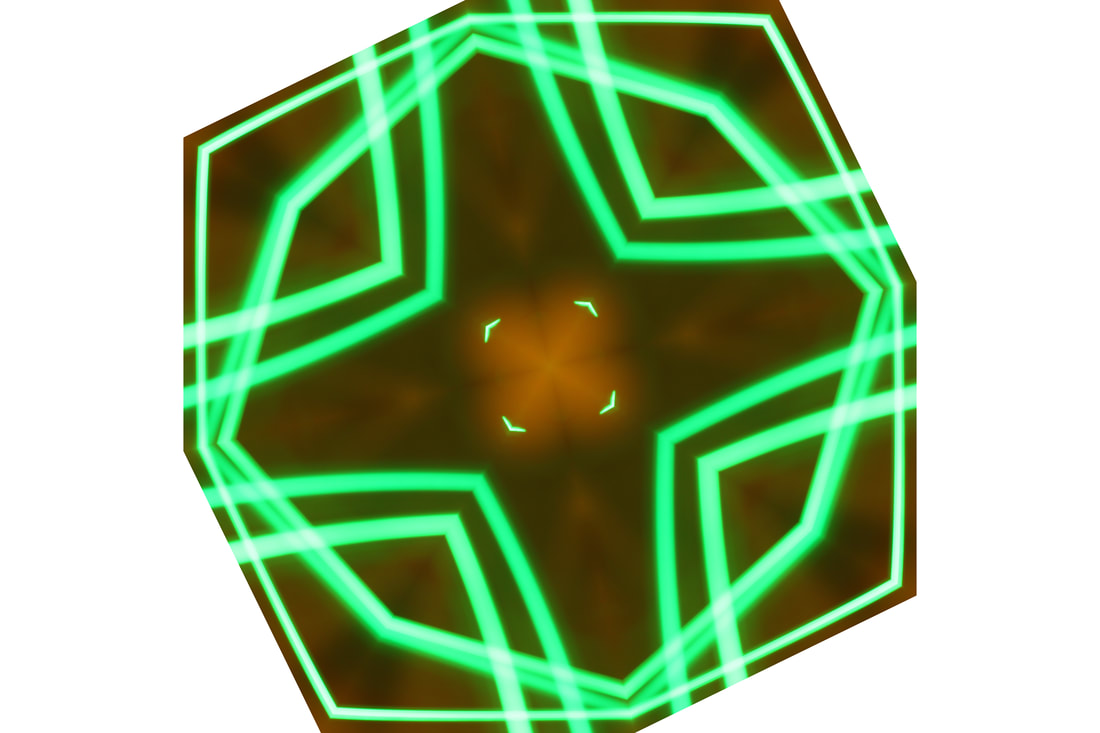
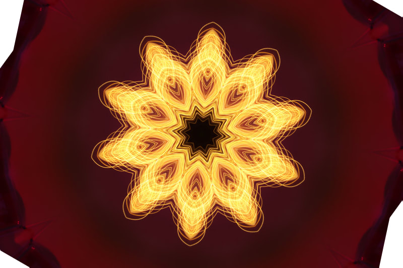
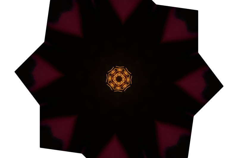
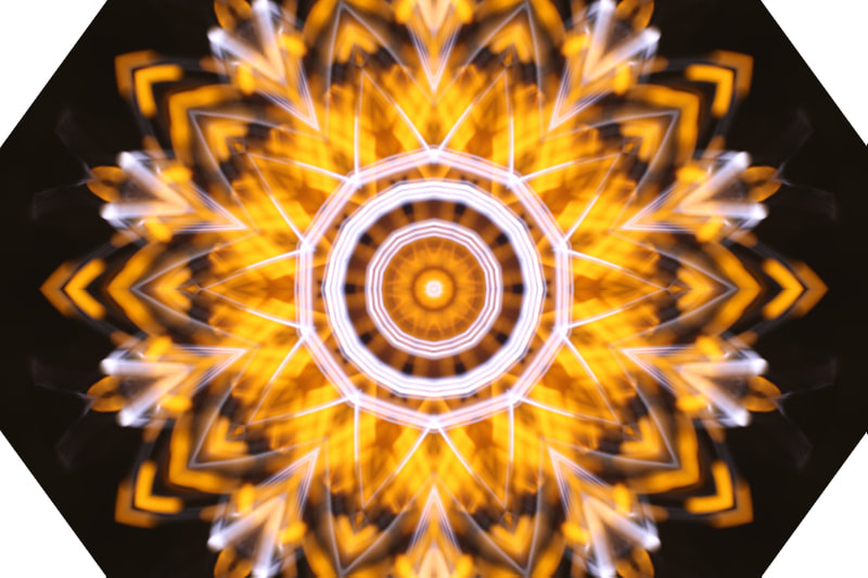
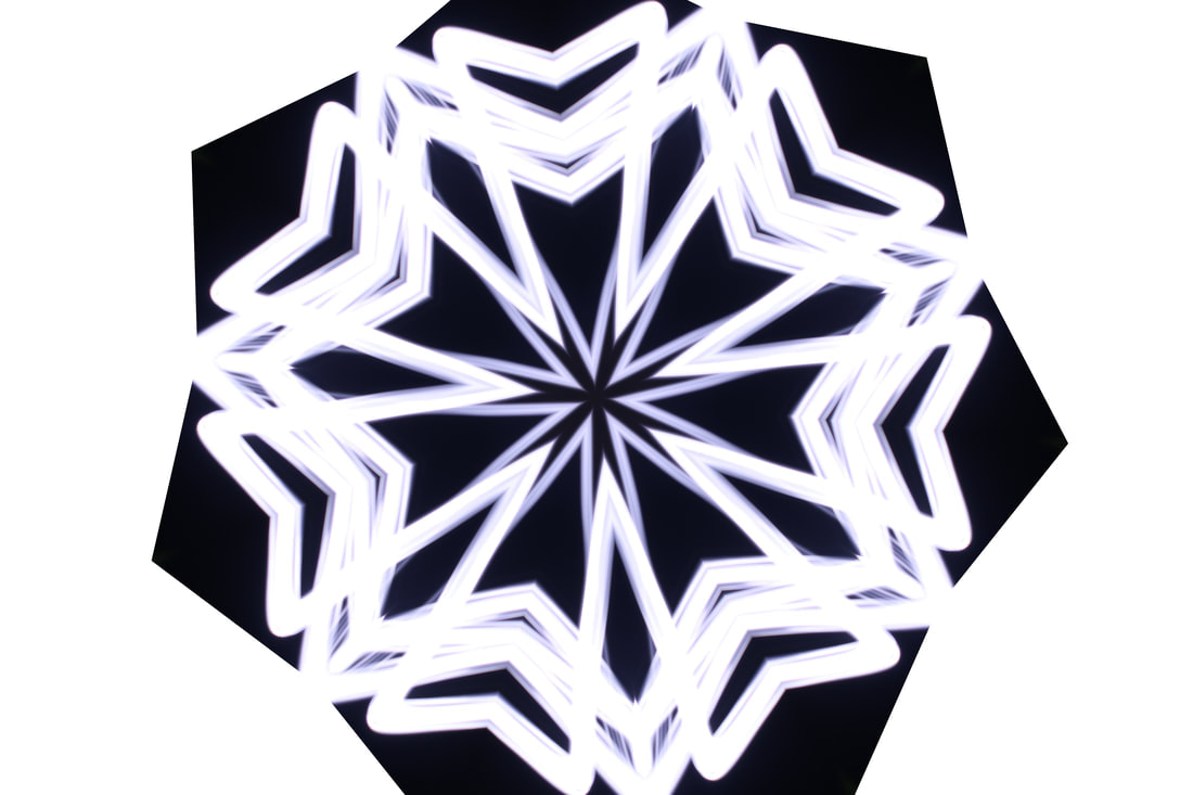
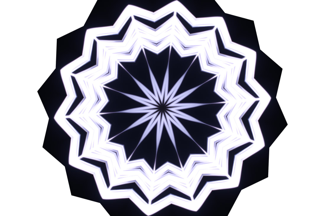
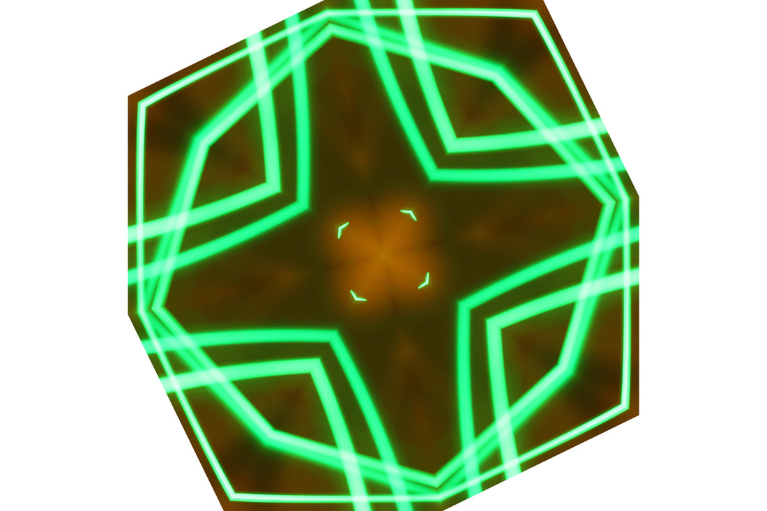
For this edit, I took inspiration from Bob Eckert, who is a light painting photographer, editing them with the kaleidoscope tool on Photopea, an alternative to Photoshop. I decided to do it myself, starting off by converting it into a smart object then simply adding the filter. I changed how many times it reflected and the angle it reflected at, adjusting it to my liking. Once I was happy with the result, I saved it and made another edit, with the same picture and different settings.
EDIT THREE
*note, i have a widescreen monitor. some details may not be very clear. please open pictures in a new tab if unclear, or check explanation after edit*


BEFORE
|
AFTER
|
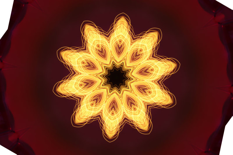
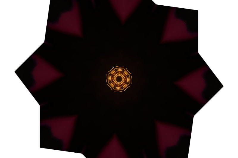
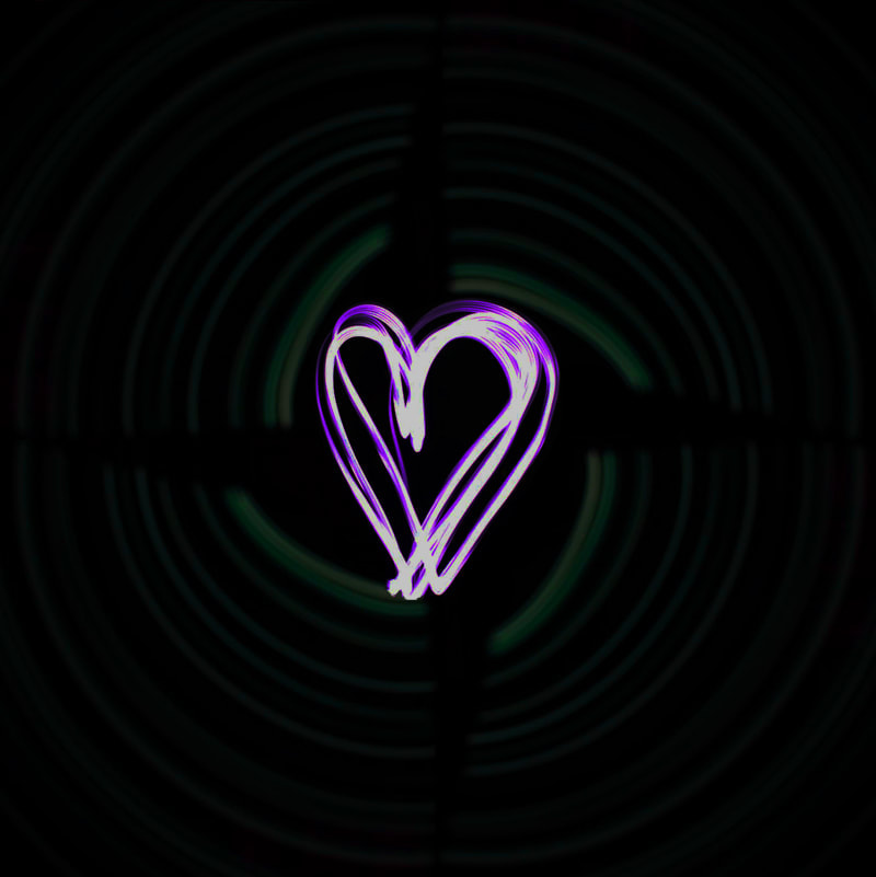
For this edit I combined two light painting pictures into one. First, I started off with one of my worst ones, duplicating it in order to make it into a circle. After rotating them accordingly, I removed some of the extra overlapping parts on the image, then hovered over IMAGE >> ADJUSTMENTS >> HUE/SATURATION and turned the yellow/brown coloured light into a more green colour, and slightly darkened it. I thought this was too similar to a previous edit, so I decided to place another image in the middle of the circle made from the lights. I took a heart shaped painting with light photo and darkened it, so that the background wouldn't be seen, using the brightness and contrast setting. I made sure to crop it so that the background would not overlap and erased any extra parts using a small brush tool. I used IMAGE >> ADJUSTMENTS >> HUE/SATURATION again, changing it to a purple, as green and purple/magenta are complimentary colours and I believed the heart would stand out more that way.
FINAL GALLERY


EVALUATION
For my "Painting with Light" project, I chose to explore the theme of colours and experimenting with which lights went well with others, looking out for the best combinations and redoing them so I can have a range of patterns. As I developed my work, I noticed that taking a good photo of lights was extremely difficult, since you never knew what you were going to achieve. I struggled with camera settings, but I managed to change it according to what looked best. During this project, I researched several artists and photographers who had explored similar themes of colours and patterns. Some of the artists that influenced my work include Vicki DaSilva, Michael Ross and Darren Pearson. I discovered them mainly through online photography forums and research in photography magazines or interviews.
In my work, I addressed the theme of texture and colour. I did this by using differently sized and coloured lights, which created streaky lines and choppiness, which I really like. It makes the photos look more rough and realistic. The combination of multiple colours made the pictures more visually appealing.My progress improved and evolved over time as I gained a wider understanding of the project, and made my work better as the photoshoot went on. Initially, my photos were very basic and bad, as the first few were underexposed, but then I realised I needed to change some of the settings, like shutter speed and ISO. Soon enough, I was able to take some pretty decent pictures and managed to make a few patterns too.
Throughout the project, I challenged myself to improve my work and wanted to make the pictures more interesting, even though I only was able to do one shoot in the end. I think I achieved this to some level as I know that my work got better once I knew what I was doing. The most difficult bit about this project was finding the right settings and lights that went with others. I struggled to find the balance of background brightness and the ISO. It took time to develop this to where I was happy with the outcome. I was hoping to create something that allowed the audience to interpret and interact with the pictures in their own way and have them pick their own meaning behind it. If I had more time, I would have taken more complex images with different light combinations, changing what I drew and maybe would have turned them into something which had an obvious meaning. I believe I did well for the first time working with a slow shutter speed and drawing with light.
