
STATEMENT OF INTENT:
As a photographer, I am drawn to the possibilities of portrait photography, a creative way of taking pictures of people to tell a possible story through different lighting, poses and points of views. There are many different ways to express my creativity through this form of photography, including using different light sources from many different angles in order to add my own personal twist on it.
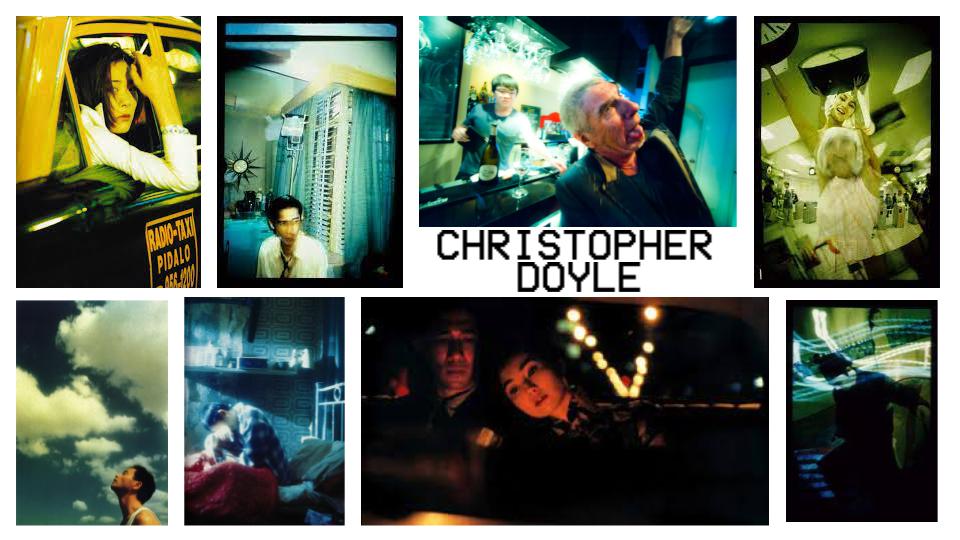
Christopher Doyle is an Australian photographer, whose photographs have a distinct style, featuring bold, vibrant and saturated colours and interesting compositions, telling stories through his pictures. Doyle's photographs clearly leave strong impacts on his audience. He captures the beauty of a place that may not seem cared for or important, finding places that photos aren’t usually taken, like in a hospital, bathroom, staircase or nail salon. He clearly tries his best to capture the struggle of life, mental health and happiness in human life with his interesting lighting, points of views (usually from another person's perspective) and emotions. Through his work, he is able to highlight clear problems in society that sometimes the media doesn’t seem to talk about, giving people confidence about the sensitive topics mentioned. His work has the ability to express feelings of nostalgia and empathy in the viewer. Overall, Christopher Doyle's photographs are powerful and leave a lasting impact on those who view them.
This artist relates to this topic because I wish to be able to tell a story through my photos in ways that can be explicit or implicit, impacting people so that they can take inspiration from what I do. I also chose Doyle as an example since he uses many different colours in his pictures, something I am really interested in using in my work, as I think that colours can not only tell stories, but attract attention too.
I would use photoshop to edit my photos by using colour correction if I happen to accidentally use the wrong white balance, or if I would like to edit the overall look of the photo. I could also overlay different pictures from previous shoots to show a high level in my editing skill and to give it more detail. I plan to edit my photos in a very colourful way, whether it's to make the subject or background black and white, or to make it overly saturated in some places to exaggerate it and make it more eye-catching. I would love to be able to have multiple contrasting colours in my work after editing.
When taking pictures, I can use many different settings to change how a photo looks, like aperture in order to make the background more out of focus, to show a higher depth level in my photography. This can affect the audience by showing them what is important in my image and what isn't. Doing this can inspire people to photograph others in the same way. I can also change how the lighting looks in order to be able to see details in my photos more, or give it a more sad, angry or gloomy look. Sometimes changing the white balance can improve a photo, depending on the style of photography you do, since not everyone wants a very "natural" looking photo.
Making sure to use compositional features also improve the quality of a photo, as features like leading lines can drag the audience's attention away from the main subject. Doing this can show more depth in my work and also allow the audience to see more detail in the photo. Another very good compositional feature that I can introduce to my work is the rule of thirds, which can balance out a photo, or even make it unbalanced, if not all areas are covered.
Overall, me looking at these photographers has inspired me to do a photoshoot about LGBTQIA+ rights and be an advocate for everyone to be able to express their own identity the way they want. At this moment in time I don't know how I'm going to go about this, however I know that I want to incorporate the flag colours into my work, for example, the rainbow and trans flag. This is something I'm very passionate about and I believe it will improve my level of understanding.
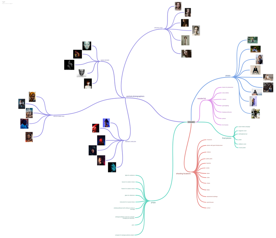
MIND MAP:

|
This photo was taken and published on December 8th 1980, by someone called Annie Leibovitz, for the 2012 movie, Les Miserables, which is based on the play from 1862, first performed in 1987. Leibovitz is an American photographer and produced many different photos for publications like the Rolling Stones, Honda and Disney. She was born in 1949 in Connecticut and got a degree in art since she wanted to be an art teacher. She started photography in 1968, where she changed her major to photography, and has taken some of the "most popular and influential photographs" ever. She's well known for her portraits of celebrities, which are commonly introduced into different magazines. Leibovitz took a very famous photograph, posted on the cover of the Rolling Stone magazine, a picture of John Lennon, 5 hours before his murder. The movie Les Miserables was originally a 1,462 page French historical novel, also shortened to Les Mis, and later made into a musical play, finally turning into a movie in the early 2010’s. The movie is about the major conflict, Valjean, who transforms himself from a thief into an honest man, struggling along the way.
In the image, the girl is in the eastern third of the photo, drawing the audience’s attention towards the right, leading their eyes to the left by the hair, which is in the centre of the picture. This makes it asymmetrical, and draws the viewer in. This could resemble the emptiness of the characters, since the movie involves a lot of social issues. It’s a portrait photo taken in landscape, representing the struggles of the play and movie, Les Miserables. This photo depicts a young, blonde girl on the right side of the picture taking up only a third of the photo. You can see a small depth of field, the background is out of focus, meaning that the aperture is set to a wider setting. The image shows the desperation and stress the girl faces, along with the dirt on her face, which emphasises the point of struggle in society during the novel. You can tell this photo was taken inside, the background being some form of screen backdrop, which is clearly slightly messy and lighter in the middle compared to the edges. This could imply that keeping things clean in the girl’s society was really difficult, furthermore conveying societal (and possibly mental) struggles. The colours used in this image include a blueish grey and lighter, more neutral colours, something that can make a subject or object much smaller or bigger than it really is, which could be the photographers real intention, since she wants the girl in the picture to be smaller and more vulnerable, creating a sense of regret or sympathy towards her. The blue could have been used as a link to the context, which are the sadness and struggles of society and her life. The light/neutral colours make it so that the girl is very noticeable among the dark colours in the background. Colours like white, beige and yellow compliment colours like dark blue, making them stand out and eliminates the distraction of colours add well as forcing the viewer to focus on the subject, textures and even shapes. This shows the audience the main purpose and subject of the play and picture. This makes the audience direct their attention to the girl. Darkness is seen as the emphasis in a photo, since it highlights the important things and is usually associated with depression, sadness or struggle, something that is a very common theme in the play this photo was taken for. This subtly emphasises the challenge in the play. The lighting in this photo clearly focuses on the left side of the photo, where the model is placed. The light is very harsh on the model and the middle of the background, giving the picture a downcast feel and due to this use of bright and muted colours, the picture and subject looks way more three dimensional.
You can see some leading lines, which draw your attention, in the middle vertical third of the image. This is represented by her hair dragging along the middle of the screen and slightly into the left, leading the audience away from the main point of the image. The background of this picture is plain and slightly out of focus, meaning that the aperture must have been around F11, maybe F16. I think the ISO she used is 400, since the photo is slightly darker in places and the image isn’t grainy/noisy. Since the model's hair is moving, it would require a quicker shutter speed to capture her hair in a still frame. It would have to be around 1/500 or 1/1000. The white balance has to be set at shade, maybe cloudy, because of the lack of natural light, however Leibovitz could have also had it at auto. This photo isn't symmetrical, as the subject is in one third of the image, meaning it's asymmetrical. The photographer used textures in the background to deepen the image more and also centered the subject in the middle, resulting in eye contact between the audience and the subject of the image.
In my opinion, I somewhat like her work. I love how the girl only takes up ⅓ of the photo, and that she looks like she’s upset over the struggles she may be facing, which adds depth and leaves room for interpretation, it interests people to watch the movie, which is the picture's purpose, to make people interested in seeing the movie/play. I like the shadow-like highlight behind her, and how it’s one of the first things you notice. I like the dull, muted colours and the shades in the background, and how the light shines on her. However, I dislike the simplicity of it, how there’s very little going on, but it makes it more effective for the viewer, it helps them understand/infer what is going on and how she’s feeling.
|
CONTEXT:
This photo was taken for the company and model “Benny Hancock”, a shaving and makeup company for men, named after the founder, Benny Hancock, and doesn’t have a specific date taken, but records show that this image was around as early as September 3rd 2020. It was taken by a man named Jake Hicks, who mainly takes pictures of people under neon LED lights and near dim lighting. Jake Hicks is called a ‘colour gel’ photographer, which are colour filters that are placed over light sources to change the colours. He’s a freelance photographer, meaning he is self-employed but is hired to work for different companies for projects, like this photo. He has been taking photos in London, UK, for over 10 years, earliest records going as far back as September 2nd 2012. On Jake Hicks' website, he gives out free techniques and tips to beginner photographers. He explains how to use some of his colour gels and how he achieved some of the photos he's taken. On his website, he states, "In the video below, you’ll see me explaining a couple of creative lighting setups that not only require very little space, but only need a couple of basic modifiers too. I explain what modifiers to use and why, plus I’ll explain where each light should be placed, but more importantly why they should be placed there. What to look for, where the shadows should be and where to position yourself to get the best look." Referring to a video he made on colour gels and how to use them.
CONTENT:
This is one of many pictures in this photoshoot, however this one shows a light beam in the middle of the picture, with the rest of it having a cyan tint, which could link to the company, since the colours blue and grey are usually associated with men and men's health. Usually, cyan and turquoise colours also represent liveliness, youth and energy, which is a big factor in Benny Hancock's company, because of his makeup and tools for men to care for themselves. Furthermore, cyan absorbs the colour red, serving the same purpose as a red filter. If you range out all the red from white light, you end up with a cyan colour, meaning it's a primary colour. The human eye is naturally more attracted to cold colours like blue, green and purple, where the goal of the photographer is to engage and interest the audience. This shows the photographers intentions when taking pictures, showing they want the audience to focus and try to understand the meaning behind what they were trying to do. The model is on the left half of the image, which is where the audience’s eyes are immediately drawn to, and then follow the bright white light beam towards the bottom right. The photo has a lot of space on the right, called the rule of space, giving it a balance and more simplistic look/feel. The image represents creativity, due to the use of bright and interesting colours, and expresses the brand really well, due to the high contrast and the very vivid colours the photographer used as lighting. The photo is taken in landscape, giving it a wider view so the audience can see more of the background. I believe this photo has been edited to have some significant changes. I know from my own research that the model, Benny Hancock has blonde hair, whereas in the picture, they have manipulated his hair to make him look more like a redhead, or increased both the vibrance and saturation on the model. If it was edited in photoshop, this could have been done by a tool called vibrance and saturation under the image tab. They could have also used the object selection tool to pick out the section they wanted to recolour. Saturation makes the image much more engaging with the viewer and it catches their attention to the brightest section in the picture. Professional photographers state that they use very saturated and vibrant colours in order to make the picture more intense and adds depth to their photo or maybe even the story behind it.
COMPOSITION:
The rule of thirds in this picture clearly present, however the model's face is in the middle vertical third of the image, leaning towards the left. More obviously, the picture is split into a half, where one side of the picture involves the model, and the other side is mostly plain. Benny Hancock's eye is almost in the sweet spot of the image, which is where the lines from the rule of thirds meet. There is also a rule of triangles, which show stability and structure in photography. This clearly shows that the picture is balanced and gives the audience a positive experience when looking at the image. The background of the image is slightly out of focus, which means that the aperture must have been set to a wider range, around F11 or F8, since it's not too out of focus, nor is it too crisp and clear, which attracts attention to the main subject of the picture. The white balance should be around daylight or fluorescent (in the range of 4000-5600K), because of the amount of light coming from the lights and LEDs. The ISO is very unclear due to the lack of information about where and when it was taken, however we can guess that it’s fairly low - around 100 or 200 - because the photo was taken in a bright place, therefore, we know the photographer doesn’t require a very high ISO, this would cause the image to be very overexposed and grainy. Due to the fact that the model was not moving much - or at all - the shutter speed could have been much slower at 1/125, or even 1/250 to make sure there wasn’t any motion blur from the model at all, however it is not necessary, especially with the lack of movement. In this image the audience is immediately drawn to the bright cyan colour and the single person who's highlighted by the white light beam in both the background and foreground, due to the simplistic composition of this image. The photographer most likely used a 35mm-85mm lens because they don't need to zoom in too much, only since the picture is more up close.
CONNECTION:
Personally, I like the colours in this picture and how they contrast and compliment each other, as well as the tinted shadows around the light beam, which gives some variety to the picture. I also enjoy the fact that this photo shows creativity and subtly shows the audience what the model’s company is about. I however, dislike the empty space on the right of the image, which could have been filled with more context behind the company, but it does leave room for more edits or a title, if it was used on the company website to promote the products or entice the viewer in. I also like that this image has many compositional elements, like how half of the image is empty, making it pretty simplistic, so that it catches the viewer’s eyes and doesn’t overwhelm them immediately.
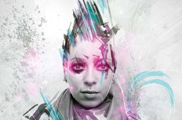
This image contains what seems to be a woman in black and white with a blue and pink neon glow around them, which are shaped as feathers and scratches. It features a nice white background with a paint splatter, making it look old and worn out, old or vintage.
I believe this photo was taken inside a studio, in front of a white backdrop to get the desired effect. I think that, due to the fact that it was taken inside and the fact that the lighting wouldn’t be too harsh, the ISO must have been lower, so as to not overexpose the image, therefore, around 200. Having a higher ISO than this would make the picture too bright. The shutter speed could have been somewhere in the middle, due to the model not moving too much, so around 1/60 or 1/125. The white balance is not too important, as the picture was edited to be black and white, however, at the time of shooting it must have been daylight or shadow to make it look natural. Similarly to the white balance, the aperture is also unimportant, as the background is plain white and would have nothing out of focus. The lens is most likely a macro or close up lens, which is 35mm-85mm, a lens that is best for taking portrait and street photography.
This photo uses the rule of thirds, as the woman in the picture is in the centre, and the other two thirds are empty, this means that not everything in this image is even, as more than half of the image is empty. The rule of thirds helps direct the audience's focus to the main focal point of an image. In a way this image can also be classed as even, since both sides of the subject are empty, this photo is very simple, as there is very little happening, due to the amount of space on either side of the subject of the picture. This feature draws the audience’s attention to the middle of the photograph, where the most important point is. It’s taken at eye level and very close up, leading me to believe that the picture was taken with a tripod, as it would be much easier to keep the camera steady. Many photographers use tripods so they can get the subject of the picture to be in the centre. Furthermore, the image doesn’t have any clear leading lines, apart from the patterns which are used to add texture to the image. These are used to draw the audience into the middle of the picture where the subject is since it’s what the photographer wants to bring attention to. Differently to this however, the picture has very subtle triangles. As you can see, the model in the picture is positioned in a triangle-looking shape because of the perspective and this makes the gaps around them slightly triangular-shaped.
This image was taken as a realistic portrait photo, having some features of surrealism due to the editing, as the hair of the person looks much different to what it must have looked like originally. I know this has been edited in a piece of software, the most popular one being photoshop, which is most likely the one they used. The editor added a black and white effect onto the entire image before and they clearly used the paintbrush tool to draw around the persons’ eyes, and later used effects to give it a glow. They could have also used photos to add the feather-like drawings on the side and used the glow, similarly to the paintbrush. The paint splatter could have been an image too, and blended in using an overlay. The main colours they used here are blue, pink and shades of black and white, allowing the audience to feel nostalgic, as black and white colours are linked with the past whereas and blue represents sadness. According to a study, the colour blue is seen as a colour of trust and loyalty, as well as helpful when remembering important information. Artists use colour to create moods in pictures and art, which possibly emphasises the engagement from the viewer. These can also be linked with family, as traditionally blue and pink represent boys and girls, therefore having the black mixed in can make it look old and introduce relationships into it too. The feathers and rip-type shapes imply this picture may also have something to do with animals, as some animals - like birds - have feathers instead of fur. This can be seen as someone who hunts, as the splatter on the background can be seen as blood. Combining this with another theory, this picture may be about hunting for family and may be inspiring to some people, leading them to take their own pictures, further inspiring somebody else. Photographers enjoy using texture because it adds a new meaning to their work and it has the capability to evoke strong emotions and add visual interest because in case the picture turns out too uninteresting. It makes the viewer want to touch the image, possibly influencing them to create their own work. This is why some portrait photographers manually add texture into their work through editing, since they are unable to capture the beauty of life, their intentions are much different from what they are able to photograph or they want an artificial feel to their final edit/work.
Personally, I have mixed feelings about this image, as I enjoy the simplicity behind the picture and the potential meaning, as well as the vibrant, bright colours and how it contains the subject in only a third of the image, however I dislike most of the added features from photoshop. I don’t enjoy the way they edited the person’s hair to look, and the feathers are slightly out of place, as there isn’t anything to link it to the original picture. Their work is aesthetically pleasing to look at, as it’s simple and easy to understand, the colours giving it a warm feeling to most people. This image links to my work through colours, as for one of my edits, I used neon colours to make it catch the audience’s eye. I also used a neon glow in order to add more depth to my images, which is what the photographer used in their photo too. To adapt my photos to look like theirs, I can do a photoshoot based off this image, to have the subjects of my photos in front of a white backdrop and later, edit the photos with bright neon colours and patterns like feathers, paw prints, rips and paint splatters. I would have to focus on my editing skills, including adding photos and making them look neon and also adding some pictures and giving them an overlay.
SHOOT ONE:
Project title:
Baseline Shoot // Shoot One
Aims for shoot:
To understand the camera settings and how to properly take pictures so they look correct and clean. I also want to be more comfortable holding a camera in my hands.
Location:
Dark room // PEXA
Props and kit:
No props
Camera, backdrop, lighting.
Camera settings:
I will use an f-stop of F22, since I do not need the background blurred. I will also use an ISO of around 400/800, since the background will be darker, therefore I need to have a brighter ISO in order to see the details of the photo correctly. My white balance will be shade, but I may change it since it might be incorrect, however I'm using shade because the shoot is inside and in a darker place rather than direct sunlight.
Compositional features:
I won't intentionally use any compositional features because I want to focus on taking pictures first and understanding the camera.
𝙱𝙻𝙰𝙲𝙺 𝙱𝙰𝙲𝙺𝙶𝚁𝙾𝚄𝙽𝙳


SHOOT ONE:

|
BESTFrom my baseline shoot, this is the best out of the ones I have taken. Although it is very out of focus, the lighting on it is fairly good, and the ISO is set to the correct setting (200), you can tell because its not very grainy or noisy.
The shutter speed was probably too low, due to the motion blur on the image. The white balance looks correct, the photo isn't too warm or too cold. The background of the scene is too dark, due to the lighting being slightly too dark and due to the fact that there are dark colours on a dark background. This results in some details in the image being lost and the image is slightly unbalanced. |
WORSTI believe this one is the worst out of the ones I've taken, due to the angles and how out of focus it is. The background of the image is very visible and the shutter speed or aperture was probably too low. This is because the field of view is very low and it looks like there is a lot of motion blur, this might be because of the slow shutter speed and movement during the shoot.
The ISO however, is correct, as is the white balance. The image isn't very noisy or grainy and the colours look very natural. The main focus of the image is very clear too, as the subject takes up most of the space. I could improve this image by making sure it's in focus and that the background is the only thing that is visible, along with the subject of the photo. This is to make sure it's balanced and not tilted. I can change the shutter speed to a much quicker speed, so that it captures everything in a still frame. |
|
SHOOT TWO:
Project title:
Outdoor Shoot // Shoot Two
Aims for shoot:
Understand a camera a bit more and experiment with settings and compositional features so I can take more advanced photos in the future.
Location:
Outdoors // Around school
Props and kit:
Camera
Camera settings:
I will use a range of different camera settings, depending on the light in every image, since the weather can change, but I plan to make the ISO between 200 and 400 on every image since it is supposed to be bright, and a white balance of shade or direct sunlight, depending on the shadows. My aperture will be F22 since I don’t want the background to be out of focus and shutter speed at 1/500 to make sure the picture looks still, and will stay the same throughout the entire shoot.
Compositional features:
I will try to use different angles like worm’s eye view and use symmetry and the rule of thirds to make each photo balanced. I could also try to experiment with framing.
𝙱𝚁𝙸𝙲𝙺 𝙱𝙰𝙲𝙺𝙶𝚁𝙾𝚄𝙽𝙳


𝙽𝙰𝚃𝚄𝚁𝙴 𝙱𝙰𝙲𝙺𝙶𝚁𝙾𝚄𝙽𝙳


𝙾𝚃𝙷𝙴𝚁 𝙱𝙰𝙲𝙺𝙶𝚁𝙾𝚄𝙽𝙳𝚂


SHOOT TWO:
|
BESTThis one is the best out of the photos I took in this shoot, mainly due to the lighting and ISO. This image is very clean and not grainy at all, a product of the correct ISO, which was 200.
The depth of field really adds to focus on a specific part of the photo, and blurs the background, adding emphasis on the subject. The white balance is set up correctly too, since the photo looks very natural, not too cold, not too warm. I also think that the shutter speed is set at the correct speed, since the background and subject is still, almost like slow motion. |
WORSTI believe that this is the worst out of the photos I took due to how dark the image is and that it's not very interesting. I think that the subject isn't the main focus due to the empty space on the right. The shadows cover most of the photo, which makes it look worse. The main focus of the image is a bit of focus
The ISO is correct, which is 200, (this is due to the fact that the image is not grainy) and so is the white balance, you can tell because the photo looks natural and it's not too orange, nor too blue. The background is fairly good, the camera captured the detail of the greenery and it fits the aesthetic. |
|
SHOOT THREE:
Project title:
Salford Photoshoot // Shoot Three
Aims for shoot:
I’m aiming to do street photography in Media City and capture a range of poses, angles and effects. I want to make sure I can experiment with styles and test out different settings, to see the difference between them and what they do to adapt/change photos.
Links with Photographers:
Saul Leiter - I’m going to try and copy the style of Leiter, by taking photographs of people, making it look like they are unaware they’re being photographed. Another redeeming quality of his is that his photos look dim, and most of the background are out of focus.
Location:
Media City
Props and kit:
Spare clothes, accessories.
Tripod, camera, lens, spare SD card, lens filters.
Camera settings:
For aperture, I will use both small and wide f-stops, the background could be in or out of focus; could add more detail or a better effect, the white balance should be at direct sunlight or shade, since we will be out in the open, so the sun will be the main light source, meaning the white balance has to be no higher than shade, unless it is dark, I will use a quicker shutter speed to make sure that when taking photos, the people are not blurred if they move accidentally and the ISO should be around 200/400 since it’s the darkest settings, and due to the direct sunlight, and I don’t want the photos to be very grainy.
Compositional features:
I will use the rule of even and odd, framing, symmetry, repetition, rule of thirds, central focal points.
Mariam - Imperial War Museum


Outside the BBC Building


Finn - Outside the BBC Building


Stairs


Blue Peter Garden


Zain - Imperial War Museum


Outside the BBC Building


Blue Peter Garden


Theo - Imperial War Museum


Blue Peter Garden


Javier - Imperial War Museum


Outside the BBC Building


Ms. Shelmerdine - Imperial War Museum


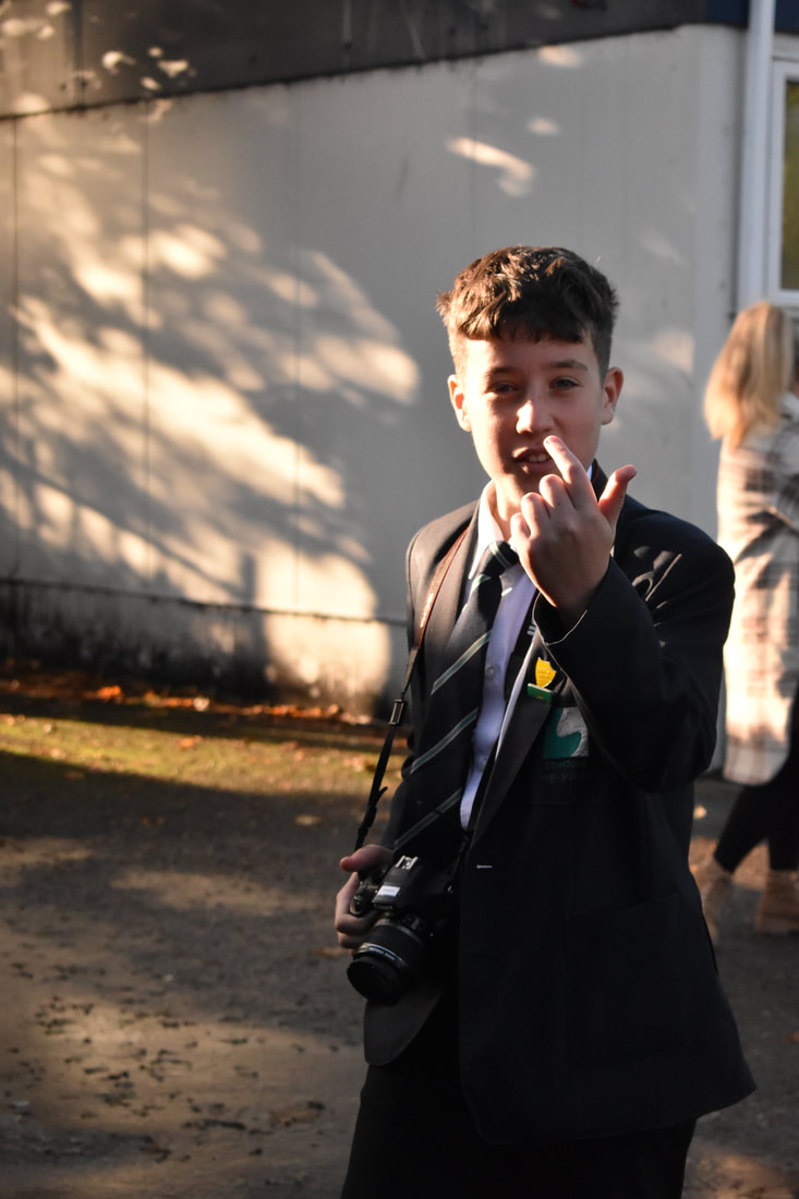
BESTI believe that this is one of my best photos from the photoshoot. This is due to the lighting in the photo, which is on the east side of the picture. The white balance is perfect, which is shown by the natural-looking colours of the model and the background. It's set as daylight, which is the setting used in direct sunlight to make sure the colours aren't too cold nor too warm. The aperture is set to about F8 due to the slightly out of focus background. The ISO is set at 200, since there is already enough natural light, so the ISO doesn't need to be too high, otherwise the picture would be much too grainy, making it much worse. The shutter speed didn't have to be too fast, since the model was not moving at the time, most likely 1/60 or lower. The person is very slightly off center and slightly to the left the further you look down.
|
|
|
|
WORSTThis is the worst image in my gallery, due to how out of focus it was. This is because the f-stop must have been much wider this time, and because the model was further away, it might have registered them as the background. On the other hand, there are some correct settings, for example, the ISO looks perfect, even though it is somewhat difficult to spot how grainy it might be. The lighting is coming from the East side of the picture, and the white balance is set at daylight, making the colours natural-looking. The model is in the middle of the picture, which is where people look first. It's also slightly in the worm's eye view, due to the low angle of the subject. The model isn't moving too much in this image, so the shutter speed would have been around 1/125. If I could retake this image I would have set the aperture a bit higher so that the background would still be out of focus, but the model wouldn't.
|
BESTThis is another really good image I took from this photoshoot. This is because of the gently out of focus background and the fact that, although it's a very busy place, there aren't many people there. The ISO might have been slightly too low, however I think if it was slightly higher it may have been over-exposed or grainy/noisy. It is set at 200 in this image. The aperture may have been lower than the other pictures because this background is much less out of focus, so it's most likely at F11, maybe F8. For the most part, the colours are correct and natural, so therefore, it might have been set at shadow or at cloudy, because of the lack of sunlight. If it was set to anything else, it would have been too warm or too cold. The model is also in the middle third, with some flowers on the right. The pose is fairly natural too, looking away from the camera.
|
|
|
|
WORSTThis is another not great picture. This is because of how far the subject is and the fact that there are people in the background. I could have changed this by having my camera more zoomed in (which would not be possible - this was the furthest zoom) or I could have changed the angle of where the subject was, as well as moving the camera to exclude them. There are some good components about this however, for example the lighting and shadows. The aperture was on auto but since the background is in focus, it would be around F32 or maybe F22. The white balance may be a bit too warm, it should be set at shade or cloudy.
|
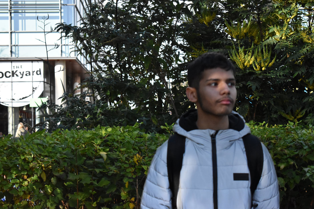
BESTI believe this is another of my best images, this is because of the out of focus background and the lighting and white balance. The ISO should be around 200-400 since it's not grainy nor too bright or dark and the white balance is set at cloudy because of the lack of natural sunlight. This gives it slight cold undertones and still manages to make it look natural. I like the composition of it, and how the model is on the right third of the photo. The aperture should have been around F8 in this picture, giving the background a faintly out of focus look, if it was a larger aperture, it would have been much more out of focus and the buildings in the background would seem less detailed.
|
|
|
WORSTThis is another of my worst pictures, this is due to many factors, some of which include the white balance and ISO. The ISO isn't too incorrect, since the picture isn't too grainy, however it is too dark, which may be because of another setting like white balance. The ISO is set to 200, when it should have been 400, and the white balance is set at cloudy or shade when it should be in sunlight, since the subject of the picture is in the direct sunlight. Another problem with this is the fact that the model is in the sunlight which results in a worse outcome, since it came out with their eyes closed. The background is in focus, but very basic and has little to no variety. The aperture was pretty wide, at around F16-F22.
If I were to take this picture again, I would make sure to change my white balance to direct sunlight. |
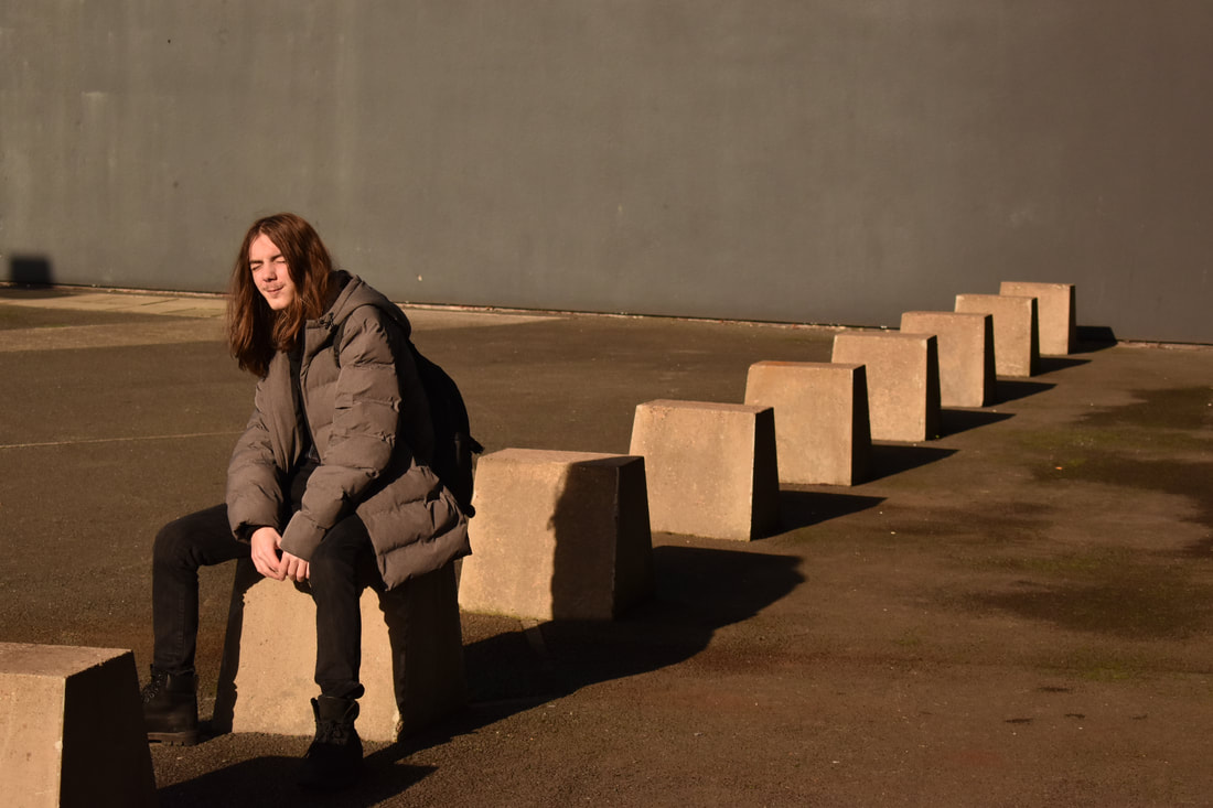
BESTThis picture is another of my best, I like how the model of this image is in the centre of it, however I dislike the fact that there is someone in the background, which ruins it. It is slightly out of focus, meaning it is around F16 and the white balance is at shade, which may be slightly wrong because of the fact that it's a little bit too warm. The pose is somewhat natural, the model looking away from the camera and sitting in a comfortable position. The shutter speed could be around 1/125 because of the lack of movement and the ISO is at the correct setting, because of the clean and smooth picture, which is around 200, since it doesn't need to be too bright due to the natural sunlight hitting the model. If I could change anything, I would make sure there isn't anybody in the background.
|
|
|
|
WORSTThis is another bad photo because the model isn't the subject of it. The camera registered the buildings as the focus point instead of the person. The aperture must have been roughly F8 because of the slight out of focus points. The rest of the picture is good, including the white balance, which is on direct sunlight. I can tell because the colours aren't too warm nor too cold, just in the middle, and the sunlight is shining directly on the subject. I dislike however the fact that the model is too out of frame and isn't too noticeable. The ISO is perfect, at 200, the image is not grainy at all nor is it too dark and not too light. Since they were not moving during this image, the shutter speed could be fairly low, at 1/60 or 1/125.
If I were to take this picture again, I would make sure the background is out of focus and the model is more in frame. |
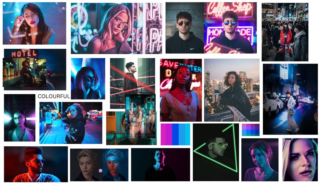
MOOD BOARD
EDIT ONE


BEFORE
|
AFTER
|
In this edit I used multiple tools to achieve my final piece. I started off by opening the original image, which is the one on the right, and selecting the model first. I made sure I had them selected before I made any further edits. I edited the vibrance of the model and the background so that it's easier to see the details. I also changed the saturation slightly, which added a slight colour pop. My next step was to change the exposure, which then darkened the picture a bit, but again made the detail more clear. Later I used the previous selection of the model to edit the colours, and I used the black and white filter to remove the colour from the model. This is so that the background stands out more.
EDIT TWO


FIRST HALF:


BEFORE
|
AFTER
|
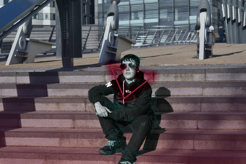
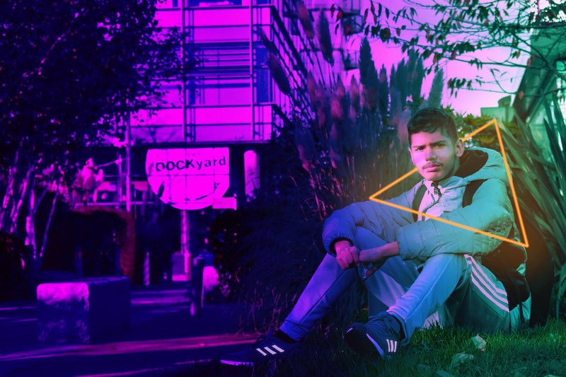
In this edit I used three different types of edits and combined them to make one complex edit. Here I recoloured the photo in the first half of editing it using the camera raw filter, which helped me achieve my final result. I wanted to make the colours very vibrant and clear, which is why in the second half I added a gradient of magenta and sea-green over the top of the whole image. I made sure that the green area was much smaller than the magenta in order to highlight the subject. I then added a neon shape and glow around the model's face to achieve a higher depth level. For this section I used the pen tool, brush and built in effects like the outer glow to give it this effect. I decided to use orange so that it stands out, since all other colours would blend in too well. Finally, I wanted the more subtle details of the subject's clothing to stand out, which is why I used the pen tool to highlight the stripes on his shoes and trousers and gave them a subtle glow so that it's clear in the final edit.
EDIT THREE:


BEFORE
|
AFTER
|
In this edit, I started off by drawing over the subject of the photo using a drawing tablet and tools built into photoshop. I used a size 4 pencil by the name of "KYLES Ultimate Pencil Hard", which is the default pencil in the app. Once I finished the drawing, I copied the layer twice so that it was the same as the first and moved them to the side by a couple of pixels. I then added a layer above each drawing layer and coloured them in with purple, pink and blue. This is because these colours match the theme of my edits. I added a clipping mask so that only the drawing was coloured in and merged the layers to make sure that I didn't rearrange the layers incorrectly. I then decided to use the words to convey a message - “No War”. I used the pen tool to draw a straight line along the words and coloured them in red and put a clipping mask with a slightly darker colour so it looks shaded. I did a similar thing with the arrow, except I used a filter to give the outline of the arrow a bit of a glow. I copied this and pasted it so both arrows could have the same look.
COMBINATION EDIT ONE


BEFORE
|
AFTER
|
I used the three edits I did before to edit this combination edit. I used the monochromatic subject from the first edit by using the greyscale feature on photoshop. I then drew over the model with the pencil tool, the size being 5px, and once I finished, I copied the layers three times and found a good colour palette on a website. I added layers above every drawing and put the colours over the top, and made those layers into clipping masks so it changed the colours of the drawing. I moved them to the sides so they didn't overlap. Next, using the pen tool, I made a path in the shape of a triangle and clicked the stroke path button to turn it into the triangle in the final piece. I then double-clicked on the layer to open the layer style window and changed the outer and inner glow to look like the bit from my second edit. Once I was happy, I had the last minute idea to add a gradient from the same red/pink to a dark blue in the background, similarly to edit two.
SHOOT + EDIT MOODBOARD
SHOOT FOUR:
Project title:
Professional Shoot One
Aims for shoot:
In this shoot, I want to have professional level photos and be able to make a new style of edit afterwards, in order to boost my grade and show a higher level of understanding and skill.
Location:
Outdoors, in front of a brick wall or on grass.
Props and kit:
Clothes, guitars, glasses.
Camera, tripod, reflector.
Camera settings:
My ISO will be 200-400 due to the outdoor shoot, which means it can’t be too high, since higher ISO makes the picture brighter and I don’t want my photo to be overexposed. My aperture will be F22 or F32, since I don’t want my background to be out of focus and I need my shutter speed to be pretty high, at 1/250 or 1/500 so that there’s no motion blur when taking pictures. My white balance will be direct sunlight, since it’s meant to be sunny, therefore this setting will make sure the colours look correct.
Compositional features:
I will make sure that my pictures are centred and equal on both sides, I may also use perspective shots by making the background look much further away than it is in reality.
PROCESS OF SHOOT


#1: ON STAIRS


#2: ON STAIRS; ANGLE 2


#3: BY WALL


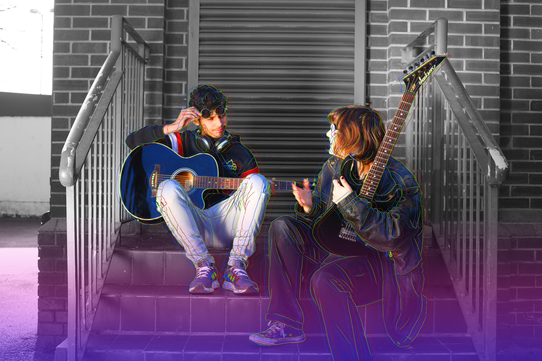
BESTI think this photo is one of my best out of the lot, as I really like the composition, how the railing frames the models, and I enjoy the lighting, which was artificially manipulated by using a reflector. The ISO was set at 100 to 200, since the natural light from the sun made it bright enough, if the ISO was any higher, it would be too grainy and overexposed. The white balance was set at daylight, so that the colours could look natural. I believe that the aperture was set at F5.6, as the background of the image is slightly out of focus. The white balance was most likely Shade or Direct Sunlight, since the image was mostly dark, with a little bit of light being reflected onto the models.
|
|
|
|
WORSTThis picture is one of the worst of this shoot, since one of the models is hiding the other, making it feel too crowded or full. I do not like this since you are unable to see both models' faces, which was not my intention. The ISO was at around 100 or 200, since there was more sunlight than the previous picture, mainly due to the reflector. If the ISO was higher, then the picture would be overexposed and grainy. The aperture was most likely at F11 or F16, seeing as the background was not too out of focus.
If I were to take this picture again, I would make sure that both the models' faces were visible. |
EDIT FOUR


BEFORE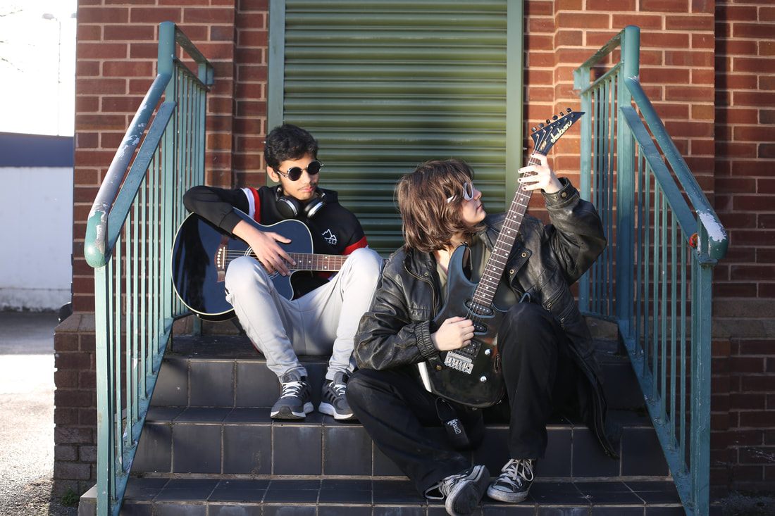
|
AFTER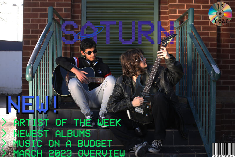
|
In this edit I started off by changing the contrast slightly to correct the dull and bright colours in the original picture. Once I was happy with that, I started to copy and paste a few .png files from a website with a font I really liked, using my favourite planet as the name of the magazine. I placed it where I wanted it and merged it into the background by erasing the parts which overlapped the guitar and model's head. I changed the blending mode to difference, which was the setting that looked the best, since the solid purple didn't seem to match very well. I drew a ring for the "A" to add a bit more detail to it. I then realised there was an apple on the railing, which I decided to remove using the "Content Aware Fill" tool. After it looked correct, I added the text in the bottom to make it seem like an actual magazine. I wanted this to be a special magazine, which is why I added the CD in the top right corner with the words "15 YEAR", which was meant to be "15 year anniversary", however it didn't fit. The barcode was the final addition, which I searched for online. I placed it in the corner along with a white background so it was more visible.
EDIT FIVE


For this edit, I wanted to make a similar edit to two of my previous ones. I drew with my pen on photoshop with the pencil tool, drawing it in green first. I copied the drawing layer and moved it over a bit, in order to make it look like a glitch. I recoloured them into red, green and blue, which are the three colours used in computer monitors. I selected the two models and increased their saturation to make them stand out, and made the background black and white too. This adds depth to my work. Finally, I added a gradient to link with my last drawing edit, and used blue and magenta, two of three primary colours.
FINAL GALLERY

In this project, I decided to explore and research the themes of nature and architecture in the background of my work, as well as the beauty of people no matter who they are. I initially believed that capturing this may be difficult, however as I progressed through, I realised that it was fairly simple. I wanted to show how my work could improve over time and the longer I did this theme, the better I felt about myself and realised that people and the world around them are unique, something I was able to capture with a camera. I took inspiration and researched the photographer Christopher Doyle, who captured the beauty of life through abstract themes, which is something I had in mind as I started my portrait project. I knew I wanted to show the way people are seen in society, as well as their raw emotions. I found Doyle through a photography magazine, where he was voted “Best Cinematography”, which helped me learn ways to improve photos through lighting and angles, showing the effects of different lighting and shadows. I tried my best to address angles and the rule of thirds in my work, making sure every photo I took was different to the rest in terms of composition, but staying consistent throughout my shoots.
In my first shoot, I decided to experiment with different camera settings and how they impact the photo, since in the start I wasn’t too familiar with what they did. In my second shoot, I decided to experiment more with angles and positions on where each model should be, in order to link to my statement of intent. This helped me be more independent with my work and understand what I needed to do after without any help. Being able to do things on my own is an important skill to me since I can understand what to do in individual situations like solo assignments, including homework and tests. In the third shoot, I made sure to use all features I mentioned before, in order to have a higher understanding of the effects of not only camera settings but also the angles or poses of the model in the picture, mixing them up to see which one I liked the most. Finally, in my fourth and final shoot, I made sure to stick to one theme and made sure to experiment with lighting, since that’s something I haven’t started yet. I developed my skills by slowly doing different things in every shoot, like changing themes, settings and angles. This helped me to know what was effective and looked good, and what things I should stay away. I realised that I couldn’t just take photos of people without thinking about what I was trying to achieve, which was a very difficult habit to get out of. I had to change my way of thinking in some ways, like managing impulsivity and thinking about time, and being flexible around that time. This helped me to improve my photography skills, since it got me a lower amount of high quality photos, rather than having tons of low quality pictures.
In my final gallery, I decided to use a mixture of my edits and some of my favourite pictures, so that it shows a range of different skills I used. All of them show a different skill, for example, the raw, unedited pictures show how I used lighting and poses to improve my photos, as well as compositional techniques, including the rule of thirds, asymmetry and depth of field, giving the pictures a more immersive and meaningful feeling to the audience, hoping they would feel the same way as me, when taking these photos. I was hoping to create a gallery which demonstrated the beauty of people and nature, and how simple things in life may be overlooked. This can be subjective, but I believe that I managed to achieve this in one way or another, since I’m satisfied with the outcome of my pictures. These photos are meaningful to me since the people in the pictures are very close to me, and in some ways, represent who I am, especially with the edits I created of them. If I had more time with this project, I think I would take more photos with different backgrounds and experiment more with edits, rather than doing a very similar thing every time. I will use this knowledge to my advantage for my next project, where I will try to improve my editing skills.
