
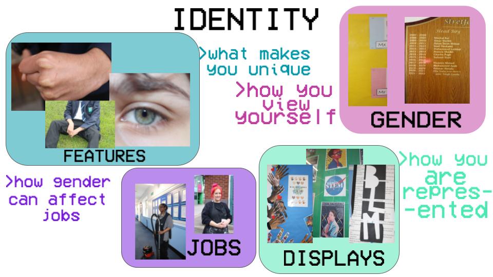
STATEMENT OF INTENT
My primary idea for my student project was to show the range of styles in people’s appearance and hobbies. I want to demonstrate how dynamic the world is, and how nobody is the same. I want to use my photographic skills to tell the story of multiple people, something they probably would not have experienced without it. Furthermore, I want to inspire my audience and make them more confident in who they are, no matter if they’re gay, straight, trans, or just want to find a new style of clothing due to my pictures. I aim to emphasise the beauty of people and how unique everyone is, as not only am I intrigued by the diversity of people in society, but I am also a strong believer that you should be whoever you want to be, to embrace yourself in any way, shape or form. Not everyone will have the chance to be themselves, maybe due to societal pressure or fear of judgement.
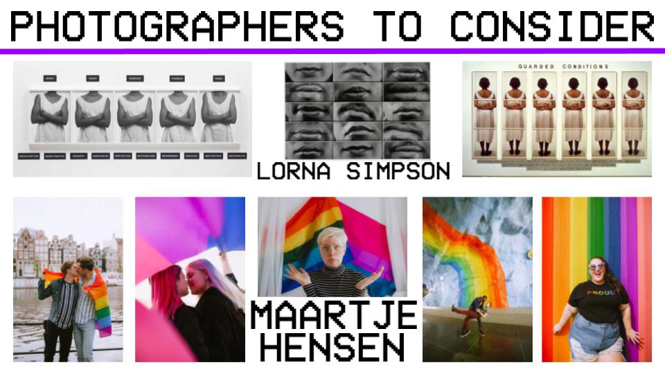
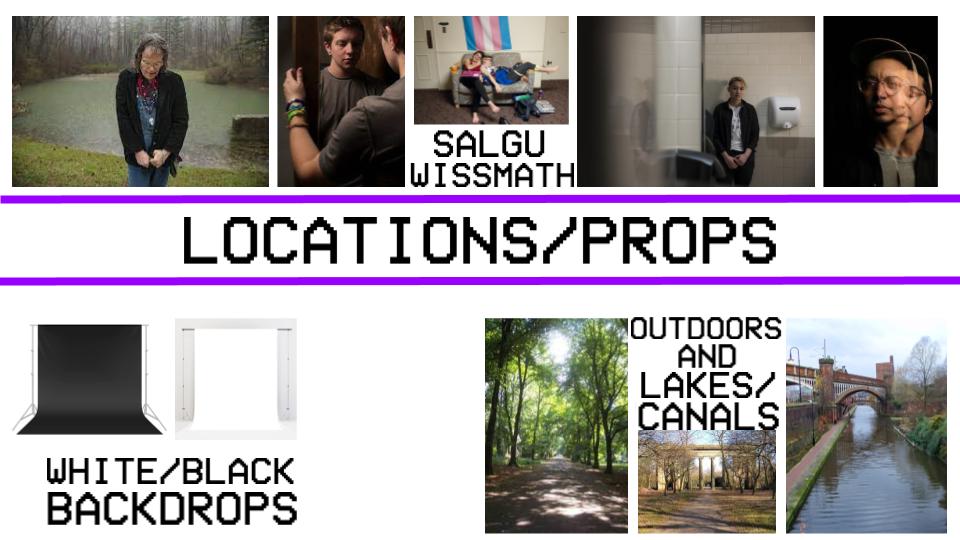
I intend to take inspiration from Salgu Wissmath (they/them), who documents gender dysphoria (a state of unease with one’s gender identity) and Lorna Simpson, someone who collects a large group of parts of people’s identity and places them in a collage, demonstrating the small pieces that add together to make up a person. I want to use the rule of thirds, where I centre my model, so that they’re the main point of the image. Their work relates to my project because I can apply the compositional features they use and I can expand and adapt on those ideas through my own personal creativity to make the work my own. I want to be able to edit my pictures so that the models are hidden, only showing what they dress like, not their facial features and appearance. I believe that this will add an interesting flair to my work, which will further show my creativity in this subject. I also want to make sure that I can improve and correct my pictures if I believe that the white balance or aperture was at the wrong setting, by using colour correction or the lens blur tool.
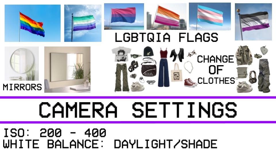
In terms of composition, I want to use the rule of thirds in my pictures, especially having all my models in the middle so that I can surround them with symbolism whilst editing. Depending on the weather and surroundings, I will use different camera settings, however I want to take most of my pictures outside. This means that my ISO will have to be 200 and white balance at daylight, as long as the weather is nice, otherwise, I would have to use a higher ISO to brighten the image and a cloudy white balance to ensure the colours in my pictures look natural. I will use a 15-50mm lens, since I do not need to take pictures from very far away. I wish to use a range of backgrounds, especially plain backgrounds in one of my shoots. This will help me to make my edits better and not too overwhelming.
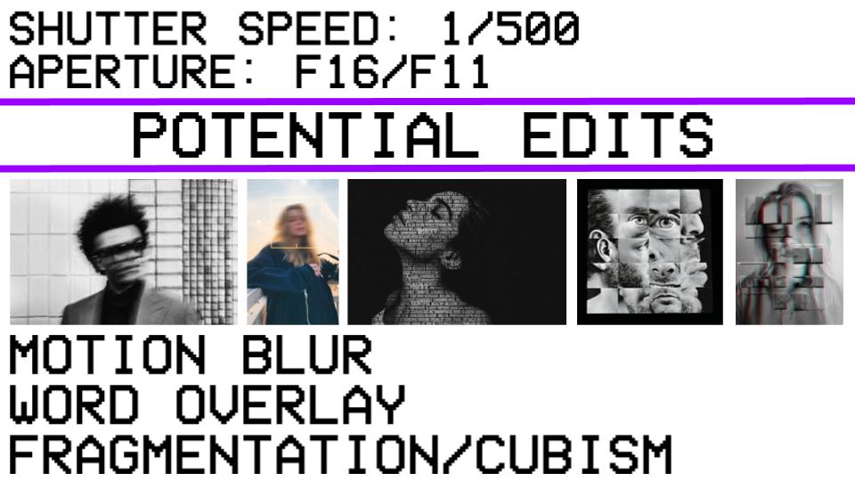
I would like to use drawing inside of my edits once again, or maybe distortion too. Furthermore, I want to use the blending modes with multiple pictures so that it shows how I use layers. This will add a lot of colour and make it very engaging for the audience, drawing their attention to every little detail, and allowing them to make their own interpretations of what it may mean and encourage them to express themselves in different ways, to explore their tastes. I believe this will add texture to my work and to add more visual interest, making it more effective and interesting to look at. It could possibly evoke emotion, like making the image seem old, with grainy or glitchy textures. I intend to add shapes into my work during the editing phase, so that it adds a sense of depth into the image, as if the meaning has layers. They're commonly used to lead the viewer's eyes to a specific point, especially if it is a really important part, which gives context or extra meaning. These will mainly consist of referring to equality and loving who you are.
I intend to take inspiration from Salgu Wissmath (they/them), who documents gender dysphoria (a state of unease with one’s gender identity) and Lorna Simpson, someone who collects a large group of parts of people’s identity and places them in a collage, demonstrating the small pieces that add together to make up a person. I want to use the rule of thirds, where I centre my model, so that they’re the main point of the image. Their work relates to my project because I can apply the compositional features they use and I can expand and adapt on those ideas through my own personal creativity to make the work my own. I want to be able to edit my pictures so that the models are hidden, only showing what they dress like, not their facial features and appearance. I believe that this will add an interesting flair to my work, which will further show my creativity in this subject. I also want to make sure that I can improve and correct my pictures if I believe that the white balance or aperture was at the wrong setting, by using colour correction or the lens blur tool.
In terms of composition, I want to use the rule of thirds in my pictures, especially having all my models in the middle so that I can surround them with symbolism whilst editing. Depending on the weather and surroundings, I will use different camera settings, however I want to take most of my pictures outside. This means that my ISO will have to be 200 and white balance at daylight, as long as the weather is nice, otherwise, I would have to use a higher ISO to brighten the image and a cloudy white balance to ensure the colours in my pictures look natural. I will use a 15-50mm lens, since I do not need to take pictures from very far away. I wish to use a range of backgrounds, especially plain backgrounds in one of my shoots. This will help me to make my edits better and not too overwhelming.
I would like to use drawing inside of my edits once again, or maybe distortion too. Furthermore, I want to use the blending modes with multiple pictures so that it shows how I use layers. This will add a lot of colour and make it very engaging for the audience, drawing their attention to every little detail, and allowing them to make their own interpretations of what it may mean and encourage them to express themselves in different ways, to explore their tastes. I believe this will add texture to my work and to add more visual interest, making it more effective and interesting to look at. It could possibly evoke emotion, like making the image seem old, with grainy or glitchy textures. I intend to add shapes into my work during the editing phase, so that it adds a sense of depth into the image, as if the meaning has layers. They're commonly used to lead the viewer's eyes to a specific point, especially if it is a really important part, which gives context or extra meaning. These will mainly consist of referring to equality and loving who you are.
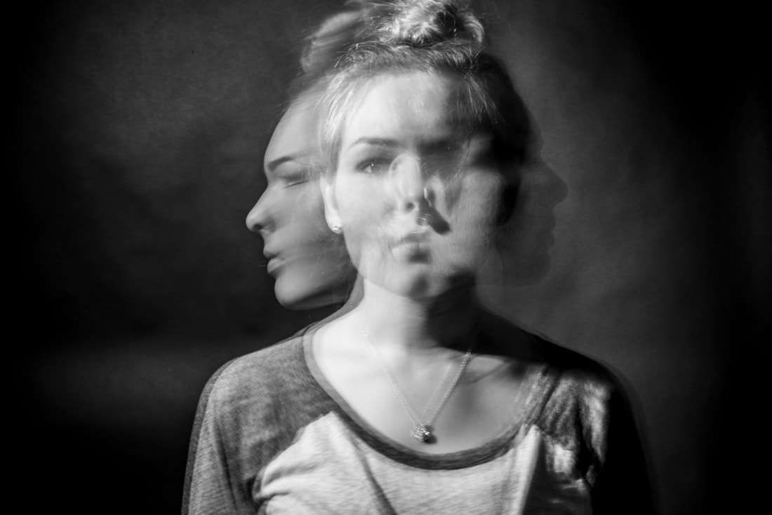
This photo was taken in March 2015 by a photographer by the name of Rachel Martin, who specialises in mainly wedding and portrait photography. This photo is titled “monsters don’t live under your bed, they live in your head.”, referring to mental health and how your own mind can damage you. She decided to take this photo to show struggles with your own identity and personify mental illness or extreme emotions. This photo is part of a collection featuring multiple mental health illnesses, this one being based around depersonalisation, an illness which simulates an out of body experience, watching yourself from the outside. She is a family photographer from Florida, taking pictures of children, family, seniors (final school year), clothing and some different projects, like this one, based on mental health.
Both the title and the photo implies that Rachel Martin wanted to make the image represent fear and anxiety that exists within their own mind, rather than physical or verbal threats and fears, in order to raise awareness or make someone feel more comfortable about themselves. In this picture, we see a woman facing the audience, with two blurry faces on either side which are slightly opaque. It’s more of a portrait photo, however it can be argued that it is slightly abstract due to the overlay, which emphasises the theme of mental health problems, disbelief and disconnection. It’s based on the illness of depersonalisation, which can be described as a feeling of disconnection of one’s own body and emotions, or the feeling of things feeling unreal - as if someone’s not in control of their own actions. This picture shows the feeling of disconnection by projecting multiple faces of the model, which can emphasise the stress of people with this illness and how they have to worry about figuring out what is real and what isn’t, almost as if they had multiple personalities.
Since this picture was taken indoors, the ISO doesn’t need to be too high, as to not overexpose it, therefore being around 200, maybe 400 at most. Furthermore, the white balance has to be shade or daylight, since there’s no harsh light which reflects off the subject. The f-stop doesn't have an affect on this picture, since there's no clear background which needs to be out of focus, as it is just a black backdrop. On her website, she stated; “It took fourteen shots to determine that three seconds was the proper amount of exposure time.”, meaning she had a longer shutter speed and she used a single picture to capture this effect, using shutter speed and pausing in specific places to make sure it looked clean. Martin most definitely used a tripod since photographers want to make sure that their photos aren’t out of focus, especially with ones that have slow shutter speeds, and the lens is most likely an 18-55mm lens, since she doesn't require a far zoom. The picture uses clear symmetry and rule of thirds, since the left and right side are both mostly empty and the middle includes the model of the picture. It’s taken at eye level, since the person in the picture is at the same level as the audience. This allows the audience to feel more connected and as if it was more personal to them, influencing them more than it would if the model was looking away. Martin edited this by changing the colour of the picture to black and white, which symbolises past memories and thoughts, which works well with the meaning behind it, a mental condition which can make the past feel fake. These monotone colours usually symbolise despair and sentimentality, a big factor of mental health. Having a “black and white” way of thinking means either being totally confident in your work, or not at all, believing you’re a failure, the tendency to see things in extremes. This is a symptom of Borderline Personality Disorder (BPD), something that can be represented by the picture, showing multiple versions of herself, something that is a huge factor in the medical condition. This can lead to many other mental disorders, like depression and anxiety, both of which are represented by black and white colours. Black and white colours also help remove any distractions from the original meaning, and makes it more neutral, which leaves room for the audience to make their own thoughts and interpretations, and can be used to make things seem slightly surreal, as if they never happened, just like the experiences in Depersonalisation/Derealisation Disorder (DPDR).
I enjoy this piece because it describes how I feel in my own body and correctly shows the feeling of living your life from a different perspective than you would do without this mental illness. It highlights the feelings that people with this condition experience, bringing awareness to this issue and why it's so impactful or painful. It's very powerful, although it’s simplistic, since it holds many meanings and visually explains how impactful a mental condition could be. I could use this to link to my work by basing a photoshoot just about mental health and how it can change people’s ways of thinking. I can make it similar to Martin’s work by also using monotone colours, which can emphasise the mood of the picture, or using a slow shutter speed to make the image seem very unreal or illogical.
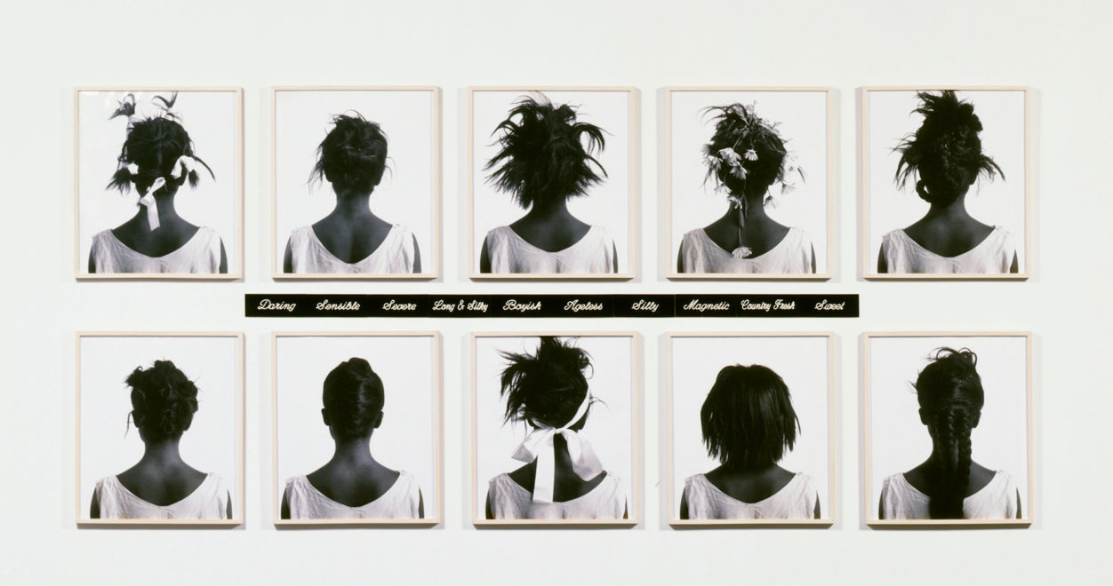
This photo was taken in the late 1990s, possibly around 1998, by the photographer Lorna Simpson. Lorna Simpson is an African American contemporary artist, born in August 1960, where she brings attention to the themes of identity, gender, and race and the problems that come with it. She manages to highlight stereotypes of black women in the 1990s and earlier by showing what they’re meant to look like according to society, through exaggeration and obscuring their faces. Simpson takes pictures of women without their faces in it, usually to show how people objectify them and don’t see them as human. She does this in order to spread awareness of racism and sexism through photography. Simpson received two National Endowment for the Arts awards, one in 1985 and the other in 1990. Her work also got featured in The Decade Show: Frameworks of Identity in the mid 1980s, and featured in the Vogue Magazine in 2017. The 1997 movie named "Call Waiting" was also worked on by her.
In this picture you can see 10 realistic and varied pictures in black and white of the back of women’s heads, all with different hairstyles. In the middle, there are 10 positive words, all showing how women were supposed to act and look like. These clearly show the struggles they had to go through on a daily basis, trying to keep in line with the expectations. This picture is titled “Retrospective”, which means “looking back on or dealing with past events or situations”. This further proves this picture is about how women were treated like in the past, and still are in some places. A good example is in the 1940s, where women weren’t allowed to fight in the war, they were meant to clean and cook, and live up to societal standards, or in the mid 1800s, where slavery was normalised, black women being bought and used for the enjoyment of other men. This title may change how someone views this picture, since they may see it as a display of how someone can choose to look, rather than how they were forced to look. The theme of this is identity and to show how society can ruin someone's self worth. The black and white colours were clearly used on purpose, since monochromatic pieces of media are usually made to represent dullness, depression, or even exaggerates and makes the image more dramatic. This was most likely done to make the audience realise how black people are treated or could be used as a memorial, since black and white can also symbolise past memories and death, which is why many flashbacks or sad scenes in movies are monochromatic, or desaturated.
I believe that she took these photos inside, shown by the very harsh lighting and the fact they are placed on a white background, which appears to be a wall. This means she would need to use an ISO of about 200 and a fluorescent white balance, in order to combat the bright lighting and make sure it’s not overexposed. Due to the lack of background and middleground, the aperture does not make a difference and would give the same result, no matter what, similarly with the shutter speed, since the pictures are stationary. I believe she has used a tripod in order to make the photo straighter, however it could have been done without one, although it would be much more difficult. The lens used is most likely an 18-55mm lens, as the subject - the photo frames - is close to the photographer. This picture has a clear use of the rule of thirds and symmetry, since in the middle there are two picture frames, similarly on the left and right. There are leading lines, since the words in the centre draw attention to where to look next, since as you read, it guides you to the pictures above and below. Furthermore, there are some leading lines between each framed photograph, letting the audience look at each photo in order. I believe this picture is unedited, as you can see, the frames are slightly discoloured, showing you that this picture was not edited to be monochromatic afterwards.
Her work really reminds me of the work of Sonia Boyce, who is an identity artist who displays her work in a collage type of exhibition. One of her pieces involved four long canvases, three of them having patterns of green leaves and red spots, and the last one having what seems to be a black woman, looking away from the audience. Similarly, she had an exhibition of four TV screens, each with different videos of black women doing creative and artistic things, to highlight the fact that everyone is capable to do whatever they want, and are the same as everyone else. These are all very colourful, in contrast to Simpson's work, who makes black and white pieces. Apart from this difference, their art is very similar, they both use collages of pictures to turn their art into inspiring pieces for the public.
Personally, I like this piece, since it highlights the problems in society revolving around black women, and the stereotypes they face every day. I enjoy the amount of content in this picture, having multiple things to look at and analyse. I could link this to my work through the theme, since I want to photograph multiple problems in society which make people feel dehumanised, for example racism, sexism, homophobia and transphobia. I could do this by using Simpson’s idea by making a collage of previous pictures and turning them into a real piece, possibly on paper or on a wall or shape. To do this I would need to focus on taking pictures to highlight problems in society and then creating my own physical art based on it. I need to focus on being more organised when doing photoshoots, in order to have more composed and consistent shoots, so they have a theme, not just a random picture.
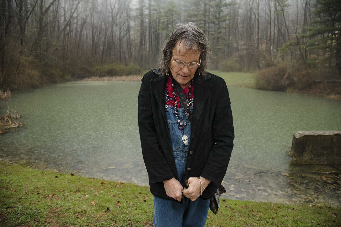
This photo was taken by Salgu Wissmath (they/them), a gender identity photographer, working for the San Antonio Express-News, who “intends to affirm and offer visibility to the trans community” (QUOTE FROM salguwissmath.com). Their work has been published in multiple articles, most notably, The New York Times and The Chronical; they strive to explain how dysphoria works through photography, highlighting how people feel and help them express themselves, even if it's in a more negative light. This is because a massive sociopolitical controversy, and has been for multiple years, despite transgender people making up less than 1% of the population. Many people blame this on the internet and "trends", when that is completely the opposite of what being trans is. This photo was clearly taken to encourage those who identify with a different gender than the one they were assigned at birth (or those who want to learn more about transgender experiences), to express themselves and show who they are in reality, boosting their confidence. On their website, there is a short interview with her, asking what she thinks people who see the project would take away from it; she said: "They [transgender community] are real people, just like everybody else. There are good ones. There's bad ones. There's smart ones. Everything you can imagine - war heroes, football players, models, every walk of life... they are there."
This photo is taken in landscape, with an older trans woman in the centre of the image, who is looking down, the background being a dim, foggy forest. The title, “Cricket” - which is the name of the woman - matches the scene, as crickets tend to live in forests, or on the soil. Wissmath took this photo to help Cricket (she/her) express herself, interviewing her and writing about the effects of transphobia on people and represents who she is in her own mind, rather than how she is seen by others. The photo is very realistic, as many people like her experience the emotions portrayed in this image. I do not think that the picture was edited in any way, neither distortion nor any special effects, as everything looks very proportional. I believe that the forest scenery is done on purpose to represent loneliness or isolation, as many transgender people are disliked by society, making them feel like they don’t have anyone to talk to. This, combined with the way she’s standing, emphasises the remoteness and solitude she may be experiencing, which can subtly influence the audience into feeling bad for her, which is most likely the meaning behind the picture Salgu Wissmath took. The slight smile also may represent her relief to be able to be herself for once, a common experience in transgender people's lives, the feeling of finally looking and presenting how you want is incredibly exhilarating.
Since this picture was taken in the fog and shade, the ISO must have been higher than it would be in direct sunlight, since it would have been much too dark if it was low, therefore, it must have been set around 400, maybe 800. Any more than this, and it would have been overexposed. Furthermore, the white balance must have been shadow or cloudy, as daylight or fluorescent would make the colours look unnatural. The aperture is fairly small, as the background is not out of focus, meaning it is around F22 or F16, and the shutter speed could be anything above 1/60, as nothing in this picture is out of focus or has a motion blur, neither is anything moving; the image is completely still. The wide F-stop was most likely done on purpose, as making the photo look much more focused on the model in the picture and even makes it look very dreamy, or slightly surreal. This is to show how Cricket may have dreamt about this happening ever since she realised who she was, finally being able to express herself. I believe that the image was taken with a tripod, since the picture is straight, however it could have been achieved without one. This picture is not framed, however it has a very clear use of the rule of thirds. Cricket is standing in the middle vertical third of the foreground, the left and right being completely empty, only filled by the background. There is no middleground, only foreground (the model) and background (the forest). Similarly to the rule of thirds, this picture also uses the rule of space, since there is nothing surrounding her, giving her space and further emphasising the meaning of isolation in this image. This photo is taken at eye level, making the image much more intimate and personal, exaggerating the meaning, therefore it’s more effective toward the audience. It’s very simple, there is no clear editing, which was most likely done on purpose, making the experience much more authentic, since gender dysphoria is a more serious topic and should not be faked or overemphasised. I believe that the clothing that she wore was used on purpose, to symbolise different emotions through different colours. The red shirt may show anger, how people in society are frustrated by those who are transgender, or, hate towards transphobic language. The red is not very prominent in the picture, which shows that it is not the main point of the image, but is a very obvious juxtaposition compared to the calming green of the background. Traditionally, green has connotations of health, which links with gender affirming healthcare, as it can improve both physical and mental health. The blue overalls most likely represent the sadness which is very common in the trans community, as people feel like they cannot express themselves, and the black traditionally symbolises loneliness and isolation, but also power and sophistication, which can show how the model is embracing herself and who she is. Taken on a rainy day, it adds to the point of sadness, as most of the time, rain is used to symbolise desolation. The water reflects the rain, giving the picture some rough, dreamy texture. There is no clear editing in this picture, but it is possible that the background was blurred in photoshop using the blur tool.
I personally really like this picture, as it represents how I feel in my own self, and it highlights the meaning of trans people and how they deserve to be equal, just like everyone else. Furthermore, I like this photo because of the background, as it looks very desaturated compared to the model and it really accentuates the woman in the picture. I like the choice of pose, since it emphasises the points already mentioned, like loneliness and sadness.
ORIGINAL IDEAS
SHOOT ONE:
Project title:
Identity Shoot 1
Aims for shoot:
To have a group of photos for my physical editing and photography, which will demonstrate my skills in multiple different ways, like skills which don't include the camera, and creativity to make my work more unique to me and the people around me, who identify in the ways I am determined to capture with my photos.
Links with photographers:
Cait Gibbs, especially the photo gallery "Hidden", in order to show what people feel like through photography in terms of mental health and what they see themselves as. I can also link with Sam Contis' work, who takes black and white photos of people in different scenarios, subtly hinting what his true intentions are. The photographer Lee Friedlander also takes photos of people with subtle hints to people's identity, like hidden words in the photos, or using compositional features to show who they are and what they enjoy.
Location:
Outdoors preferably in front of a plain and basic background, like a brick wall or a field of grass.
Props and kit:
>Basic clothes, which don't tell much of a story, no specific pattern.
>Camera, tripod, lens filter, long range camera lens (70-300mm).
>Paper face coverings.
Camera settings:
I will need to make my ISO around 200, maybe 400, due to the shoot being outdoors, unless the weather is bad, then it would need to be around 800. My aperture will be F32, since I don't want the background blurred at all and the white balance will be direct sunlight. In case of bad weather, it may have to be shade.
Compositional features:
I will use symmetry, close ups and textures for this shoot, since I want it to link with the topic titled "Hidden" by Cait Gibbs, a series of pictures where people hide their faces with multiple methods, like paper and masks. I can combine this into my plan. I will use the textures too as an overlay for my edit so it adds depth to the picture.
SHOOT ONE:


SHOOT TWO:
Project title:
Identity Shoot 2
Aims for shoot:
Take photos of people who have different identities, in terms of style, race, markings/tattoos and so on. I want to have a range of different people and ways they express themselves, so that I can show the amount of different people and how you can express yourself.
Links with photographers:
I want to link my work with Salgu Wissmath (they/them), an LGBTQ photographer, who dedicated their photography career to highlight people's identity, especially LGBTQ identity and trans identity. I also want to link my project to Daniel Bruno Grandl, who is a fashion street photographer, which links with identity. I want to use his use of camera settings like aperture and also lighting to get a very clear view of who they are.
Location:
Manchester City Centre/Piccadilly Gardens
Props and kit:
Camera, medium range camera lens (18-55mm).
Camera settings:
This depends on the weather, assuming that the weather is dull, the ISO should be around 400, the white balance will be Cloudy, or Shade, however, if the weather is good, the ISO should be no higher than 200 and the white balance should be Daylight. The rest can be chosen depending on the scenario of the photo I want to take, however I think the following will be the best; shutter speed 1/125 or 1/250 and the aperture will be between F8 and F4.
Compositional features:
I want to use the rule of thirds, which will make the picture more pleasing to look at and may give the picture more meaning, since it can be linked with spacing. This is usually used to show a lack of something, as if something was missing. I will also use the birds and worm's eye view, since it can show different perspectives and angles of people, turning it into a more interesting project, giving people more room for interpretation.
Overall, I intend to have a photoshoot with a lot of variety, by taking pictures of the general public and being able to use them in my future edits to highlight the variety and diversity of people in Manchester. I wish to be able to give people somewhere to express their identity, as I believe that people having a different part in society is amazing. Usually, people do not realise the impacts they have on others, whether it is about clothing and style, or just confidence. I will try to find people working multiple different jobs and styles, so I can collect them together in my identity project.
Mariam
>eyes


Theo


Zain


Man In Collared Shirt


Restaurant Worker


Musicians


SUIT GUY


Person Playing Piano


Person With Piercings


Person With Tattoos


Man With Cool Glasses


Woman With Jamaican Bag


Maid Outfit/Café Worker


Man On Mobility Scooter


Person Eating Lunch


Man Eating Lunch


Builders


Worker


Haircut


CANDID PHOTOGRAPHY
General


Man On Phone


Woman with Flowers


Group of Friends


BESTI believe that this is one of my favourite photos I have taken throughout the whole shoot, as the composition is perfect in my eyes as the model is centred and fills the entire shot. This, combined with the out of focus background, caused by a wide aperture which was around F4 or F5.6, makes the man look important and like the picture is about him. The colours on his suit make him stand out from the background, as they are unique compared to most suits, usually black or white. Overall, the colours are natural, as I used a white balance of Direct Sunlight, since the only source of light was the sun, and any other setting, for example shade, would make the image look too warm in colour. Furthermore, the ISO was set to 200, because there was enough lighting around the model, and any more than 200 would have caused the image to be overexposed and grainy.
|
|
|
|
WORSTThis is one of my least favourite pictures, by far, as one of my classmates got in the middle of the picture as I was taking it. The photo would have been perfect otherwise, as all the settings were correct. Similarly to the previous, the ISO was at 200, which is clear because of the sky in the background, which is overexposed. The white balance is at Direct Sunlight, as the colours look natural, rather than too warm or cold, and the aperture is set really low, since the background, middleground and foreground are in focus. The shutter speed must have been pretty quick, as there are both moving cars and people, which both turned out to be completely still. Although it was set at auto, it was most likely at 1/1000 at the time of taking the picture.
Next time I will make sure that my aperture is wider and that I make sure my subject of my photo are out of the way whilst taking pictures. |
BESTI also really enjoy this picture, as this picture is very complex in composition and what's happening around the model. I used the rule of thirds to place the model in the centre of my image, which helped to draw attention to them. The colouring on this image is fairly natural because of the white balance, which was set at shade, since the photo was taken indoors and there was less cold lighting, meaning it had to be neutralised by a darker white balance, however the tiles and wall colour might have changed how the colour looked. The ISO was set at 400, since it needed to be brighter than outside, seeing as the photo was taken in a slightly darker setting. The aperture was set pretty low, as I did not want the background to be out of focus, therefore I set it at F16.
|
|
|
|
WORSTThis photo is really bad, as the model is out of focus and facing a different direction. The aperture, which was set at F16, blurred the background as it decided to focus on the fridge in the foreground. The ISO was still set at the same setting, which was 400, and the white balance was shade, in order to neutralise the bright yellow tinted light. I attempted to take a picture of them while they were working, however, I clearly did not get it done well, as this picture will not be very useful for editing.
Next time, I will make sure to take care when taking photos, as this is the result of being reckless and trying to take a picture too quickly. I will make sure to have the camera focus on the model rather than an object. |
BESTI love this photo, since I managed to capture a very detailed eye unintentionally. Firstly, I know that my shutter speed was at 1/2000, as I took this picture while moving, and I set my shutter speed to a high setting whilst not taking any pictures with purpose. The ISO was set at 400. Although this photo was clearly taken outside, meaning the white balance was set to Direct Sunlight, the result of quick movement and shade coming from the model's face made the picture darker, which also meant that the ISO must have been higher, to lighten the image. There is the use of space and asymmetry in this photo, as the left side of this image is fairly empty and uninteresting, and the right side has the eye, meaning that the photo is asymmetrical.
|
|
|
|
WORSTI decided to take eye pictures after the previous one, however this was the worst one out of all of them. This is because the image is very out of focus and the colours are very dull. This was caused by me not adjusting the focus accurately, and the white balance was wrong, as this photo was taken in shade. However, the composition is very good, since it consists of the rule of symmetry, which makes the picture more engaging to look at.
Next time, I will make sure to adjust and check my focus before taking pictures and verifying what it looks like beforehand. |
BESTI really like this picture, as it reminds me of a movie scene, due to the out of focus background, caused by the aperture being fairly wide, around F5.6. I think this image links with my hidden identity project I plan on working on, which is the reason why I decided to use this pose. The image feels slightly surreal to me, mainly due to the people around the model. The ISO I used to take this image was 400, since the image was taken outside in the shade, meaning the ISO had to be slightly higher, so that the image would not come out underexposed. Following this, the white balance was set to the Shade setting, to make the colours look natural in the lighting it was taken in. This photo consists of asymmetry and space, since the model is leaning to one side of the photo, and there is a lot of empty space in the bottom of the image, only filled by a wall.
|
|
|
|
WORSTI do not like this image because of multiple factors. First of all, the model is looking away from the camera, which was not my intention, the foreground is too in focus, and has multiple people standing in the way. I also do not like that the aperture was set too small, which was still F5.6, however the background was less out of focus, as the camera centred around the people in the front of the image, meaning there was less background. The ISO was still 400, and white balance was Shade, which I set according to the lighting, which was darker than previous shooting locations.
If I were to take this picture again, I would make sure the camera was focusing on the correct point of the image and that the model was looking straight ahead. |
BESTI really enjoy this image, mainly because of the lighting in the background, as well as how aesthetically pleasing it is, with the mixture of the model's pose and the reflections in the background. I set the ISO at 800 because this photo was taken in the shade, where there was very little lighting. This helped me achieve the reflections in the background, which would have been less visible if the image was more exposed and brighter. The white balance was most likely Cloudy or Shade, since it was not taken in bright light, like sunlight. I believe that the shutter speed was at 1/800, as the model was not moving, however it would have been more beneficial to have a higher shutter speed, just in case he happened to move in the middle of the photo. The aperture was very small, as the background is very clear and in focus, around F32 or F22. This photo consists of the rule of thirds, as the model was in the centre of the image, but also space, as most of the other two thirds are empty, unlike the middle.
|
|
|
|
WORSTUnfortunately, this photo is one of my worst, seeing as someone got in the way of my image whilst I was taking it. However, it is in a very small section of the image, which can be sorted out with a simple crop. Other than the person in front of my image, I really like it, the model is in focus and the background has the same reflections I was hoping for, making the photo look very natural, realistic and engaging to the audience. The ISO and white balance were still at 800 and Shade or Cloudy, due to the lack of lighting around the model, and the ISO was still set at around F22. My intention was to leave more space on the left, still using the rule of thirds method.
If I were to take this picture again, I would make sure to keep other people, which do not benefit my image, outside of my frame, and move, or ask them to move over slightly. |
EDIT ONE:
For this edit, I want to use my natural form project to use in this edit, because I feel like it would make my edit look really interesting. I also want to have the entire picture to be monochromatic so that the flowers stand out in the picture. I also want to fragment the picture and separate some parts of the model to make layers and add different blending modes onto them too.


This was a practice for my future mock, where I decided to have the model's face hidden by a bouquet of flowers, and then fragment some of the picture and recolour them. I started by importing pictures from my old natural form project and I cut them out to make them fit. I made the entire picture monochromatic, and used the rectangular marquee tool to select pieces of the picture and duplicate them back onto the picture. I later coloured some of the fragmented pieces of the picture to make them look more interesting. I copy and pasted the whole picture and set the layer channels to exclude the red channel, which left a glitch look on my edit.
MOCK EDIT


During my mock, I used my previous plan to edit my picture, which I did using the flowers I took previously. I used the black and white tool first, which simply changed the entire picture into black and white and picked out a few flowers to add on top of their face. I chose 3 different ones, and tried to have a colour theme, however I believe that the yellow does not match very well. I noticed that the shirt they were wearing may be able to add some colour into my picture, so I copied it and pasted it back onto the picture. Later on, I used the rectangular marquee tool to make the fragmented pieces, which I then recoloured them on a new layer with an overlay. I used the transgender colours to link it with their shirt. I blurred the background so the model could stand out and finally, I copied the picture and offset it, removing a channel to make a glitch effect like the previous version of the edit.
SHOOT THREE:
Project title:
Identity Shoot 3
Aims for shoot:
I want to have more professional looking pictures with props so that I can link it with my original plan of hidden identity. This will include a range of props so that I have something to pick from when editing.
Links with photographers:
Cait Gibbs, who made her "Hidden" project, based around hidden identity. I want to express myself through the vision of other people, as a way of linking my work with myself. This will help me know what I want this project to look like, as I will be able tp input personal feelings and my own hobbies in as well. I wanted it to be hidden identity as I want the audience to relate to my work, since anyone can be behind the photo.
Location:
Indoors, in front of a dark backdrop.
Props and kit:
>Basic clothes, maybe some sort of pattern
>Camera, tripod, short range camera lens (18-50mm), bright lights
>Props; camera, flower, umbrella
Camera settings:
The ISO will need to be fairly high as the subject will be in a dark room, although this might change with the use of strong lighting. I estimate it to be around 400 or 800, and the white balance to be Fluorescent, as the lighting will most likely be a bright white colour, therefore it needs to balance it to make the colours look natural.
Compositional features:
I want to use the rule of space on either side of the model, as well as the rule of thirds, since I mainly want my subject in the middle of the picture. This would mean that, for most of it, the shoot will be pretty symmetrical.
SHOOT THREE:


BESTI love this photo, the model is directly in the middle and the camera is looking directly at the people who are looking at the picture. I enjoy the asymmetry of the arms and how they almost frame the camera in the middle. The ISO was set to be at 100, since I wanted the picture to be slightly darker, and it was combined with very bright lighting, and if I had a higher ISO, the picture would come out significantly too overexposed or grainy. I made sure this wasn't the case by doing multiple test shots. The aperture is not too visible, as the background is a solid colour, meaning it would not affect it no matter if it was high or low. The white balance was at fluorescent, since the lighting that was used was in a cool colour, meaning it would project that onto the model, combined with the dark blue background.
The image uses shadows, dark on the left but light on the right, which I wanted to do mainly due to the model's outfit and how they had mainly black and white colours on. I also wanted to link this with memories and identity, which is why I decided to use dark and less vibrant colours. |
|
|
|
WORSTI think this photo is much too dark to decipher what is happening, due to the wrong mixture of settings and lighting. This was one of the early test shots, which is why it is not perfect. The settings were almost the same as the previous, with the ISO being 100, and the white balance was florescent. It was different this time because the lighting I used did not work the way I intended. Rather than lighting up the model's face significantly, it was too dark at the end, the power was lower than needed. To improve this, I made sure to increase the power on the lamp, as well as add an extra one on the other side to increase the amount of light bouncing off the model and the camera in their hand.
|
BESTI really like this picture since it is exactly what I wanted from my photoshoot. I managed to hide the model's face slightly, since I intended to make my project based off hidden identity. For this picture, I used the ISO of 100, as I had extremely bright lighting from both the left and right of the model, which helped illuminate the entire scene. The aperture was most likely F8, seeing as the backdrop looks slightly out of focus, but it is very difficult to tell due to it being a single colour. I set the white balance to either flash or fluorescent, as the lights used were bright and bouncing off the blue backdrop, so I needed to neutralise the colours with the white balance.
I also purposefully placed the rose in that position, as you can see a slight line of symmetry between the two sides of the roses. I love the symmetry of the entire picture, although the hands do slightly ruin it, since they're in two different vertical positions. |
|
|
|
WORSTI kind of dislike this picture, since the model in the picture is very out of frame and it is not very symmetrical. I tried to highlight the idea of headphones being apart of someone's identity, which I believed was a good idea, but failed in my attempt to do this. I used different lighting settings this time, making the background a bit darker. I reduced the power on the lights and changed the position of them to light up the model from below rather than above this time. I used the same camera settings, ISO at 100 and white balance at fluorescent or flash. I did not attempt this style of picture again, as it was not something I liked the look of in reality, only looked good in theory. I do really like the darkness of the lighting though, which definitely try yo recreate if I do another photoshoot.
If I were to try again however, I would try and make the model's hair less obstructive and test the position of them to make sure they are in the centre of the picture. |
EDIT TWO
I want to use different blending modes for this edit as I thought it shows my skills in composition and colour, as it allows me to pick which colours go well with each other. I know it might give the picture a bunch of layering and gives the audience a lot of things to look at. I will make sure not to make it look too overwhelming but use enough methods to make the picture look interesting too.


In this edit, I used multiple photos from my past projects to make my edit link back to things I have done before. Here, I made my picture black and white, so it had space to add a picture overlay and that the colours weren't overwhelming. I added colour dodge on the first picture, which kept the image very dull and colourless, which is something I really liked. I made sure the model's face was not being obstructed by the building I used, so I ended up using the eraser tool to delete some parts. I did the same with my next picture, which was curved, so I decided to add it behind the model's head. I blended the bottom of it with the soft eraser tool, and later added a pigeon on their arm. I recoloured it to be white, since I wanted it to have connotations of a dove, but ended up adding some blue to make it fit in with the picture more. Last of all, I wanted a little bit of colour, which is when I added the purple flower I took in a previous photoshoot. It matched the curve of the other image, which is why I placed it where it is.
EDIT THREE


For these styles of edits, I added different sections of images on top of my identity pictures, as I wanted to experiment with what the blending modes would look like. I did this by cutting out the images with the selection tool and using the eraser to remove extra parts I did not need and used appropriate blending modes for each of the images. I made sure each outcome looked different, meaning I would use different pictures and colours. I decided to experiment in my 3rd piece, with different colours which would stand out in the picture, like blue, green and pink.
FINAL GALLERY

EVALUATION
In this project, I decided to explore and research the themes of identity and diversity including but not limited to the LGBTQ+ community. I wanted to capture the beauty and uniqueness of people no matter who they are, and how they express their identity through their appearance, style, and personality. I took inspiration and researched the photographer Lorna Simpson, who made physical photography and created exhibitions based around how people look and who they are as a person. I took this theme of being proud of who you are and criticising those who challenge your identity by giving my model creative freedom of how they wished to pose and portray themselves, in order to keep the photoshoot around them. I did however, try to experiment with different angles, a lot of them being from the side or even from above, which gives different effects and makes my photography much more dynamic. I made sure every photo was different from each other, never having two models look the same, so I can make sure everyone is separated from each other.
My first shoot was very small, as I was still experimenting with what I wanted my project to be like, however I knew I wanted to photograph people who had a unique identity, in different poses and different scenarios. I highlighted what made someone themselves, checking to make sure that I captured what I intended to when starting the project. During my second shoot, I felt much more free in the project, since I would be around a more diverse group of people. This meant I had more opportunities and more time to do what I wanted. For this project, I used a wide range of compositional techniques, especially different angles. This includes the rule of thirds and space, as well as birds eye view. These helped my work be more dynamic, and I made sure to photograph all of my models from different angles so I could choose which one suited my edit the best. Since I was outside, for most of my images I used a low ISO, otherwise it would be overexposed and much too bright. Furthermore, I used a few different white balances, clearly seen in my work. It ranged from cloudy and shade to daylight, this is due to the mix of weather and how sometimes, the sky would be covered by clouds. My third and final photoshoot consisted of using one model, some props and a blue coloured background. This linked to my photoshoot since I wanted to do something with hidden identity. I decided to experiment with different lighting techniques, by using professional equipment to light up the model from multiple angles. This made it much more interesting to look at and helped me develop my work. Compared to my first project, this looks much better and I am happy with the outcomes. I stuck to my statement of intent by keeping my models diverse and different from each other, since I preferred to have a range of people in my work, in case I wanted to have different styles of edit. I managed to use different blending modes in my work, which helped me make a collage of my photos. I am really proud of what I did, since it allowed me to express myself through edits and allow people to have somewhere to portray themselves as who they are.
During this project I hoped to create something that reflected my own personality in a way and give people the opportunity to express themselves through my work, which I believe I managed to do. I believe I linked it to the theme of identity really well as I showed who people were by photographing their clothes and parts of themselves, like eyes and hands. I made this personal to me, as I know some of the people I photographed really well, and they are very close to me, meaning I can edit them in ways that I see them. With this project, I hope more people understand that being yourself is beautiful and they should not be ashamed of their own identity, since we are all different.
